Charles A. S. Hall “EROI of different fuels and the implications for society”

Charles A.S. Hall, Jessica G. Lambert, Stephen B. Balogh. 2014. EROI of different fuels and the implications for society. Energy Policy 64: 141-152.

Highlights:

  • For nations examined, the EROI for oil and gas has declined during recent decades.
  • Lower EROI for oil may be masked by natural gas extracted/used in oil production.
  • The EROI trend for US coal is ambiguous; the EROI for Chinese coal is declining.
  • Renewable energies lack desirable fossil fuel traits, including often higher EROI, but create fewer pollutants.
  • Declines in EROI of main fuels have a large impact on economies.

Abstract: All forms of economic production and exchange involve the use of energy directly and in the transformation of materials. Until recently, cheap and seemingly limitless fossil energy has allowed most of society to ignore the importance of contributions to the economic process from the biophysical world as well as the potential limits to growth. This paper centers on assessing the energy costs of modern day society and its relation to GDP. Our most important focus is the characteristics of our major energy sources including each fuel’s energy return on investment (EROI). The EROI of our most important fuels is declining and most renewable and non-conventional energy alternatives have substantially lower EROI values than traditional conventional fossil fuels. At the societal level, declining EROI means that an increasing proportion of energy output and economic activity must be diverted to attaining the energy needed to run an economy, leaving less discretionary funds available for “non-essential” purchases which often drive growth. The declining EROI of traditional fossil fuel energy sources and the effect of that on the world economy are likely to result in a myriad of consequences, most of which will not be perceived as good.

1. Introduction

Energy has played a critical role throughout human society’s demographic, economic and social development. The availability and quality of various energy and material resources to a society is linked to the general trend of the settlement, growth, and eventual decline experienced by each civilization (White, 1959 and Tainter, 1988). A society must have an energy surplus for there to be division of labor, creation of specialists and the growth of cities, and substantially greater surplus for there to be wide-spread wealth, art, culture and other social amenities. Economic fluctuations tend to result, directly or indirectly, from variations in a society’s access to cheap and abundant energy (Tainter, 1988 and Cleveland et al., 1984). Today, fossil fuel resources are among the most important global commodities and are essential for the production and distribution of the rest. Fossil fuels supply greater than 75% of the total energy consumed by societies (EIA data for various years as discussed in Hall et al., 2009). The prosperity and stability of modern society is inextricably linked to the production and consumption of energy, especially oil (Odum, 1973, Hall et al., 1986 and Hall and Klitgaard, 2012; Tverberg, 2012).

Economic production, exchange and growth requires work and consequently a steady and consistent flow of energy to do that work. Longer intervals of sustained economic growth in countries and the world have been punctuated by numerous oscillations; i.e. there are periods of economic expansion but also recession. In general, the growth of real GDP is highly correlated with rates of oil consumption (Murphy et al., 2011). Four out of the five recessions experienced since 1970 can be explained by examining oil price shocks (Hamilton, 2009, Hall and Groat, 2010 and Jones et al., 2004). During periods of recession, oil prices tend to decline, eventually encouraging increased consumption. Alternatively, during periods of expansion, oil prices usually increase and higher energy consumption and economic expansion are eventually constrained by these higher prices (Jones et al., 2004). Economic growth and stability is dependent on not only the total quantity of energy accessible to society but also the cost of this energy to different sectors of that society. Jones et al.’s (2004) article, Oil Price Shocks and the Macroeconomy, demonstrates a clear relation between oil price and GDP. The main conclusions drawn from this and similar assessments are:

(1) Decreases in GDP during the post WWII period are chiefly attributable to oil price shocks, not government policy.
(2) Oil price shocks are the only novel or surprising price movement observed in a 2-year window of time prior to a recession.
(3) Oil price shocks lead to costly reallocations of people and industries as well as fluctuations and pauses in investment. This influences industrial output and subsequently GDP (Jones et al., 2004).

1.1. Economic cost of energy

The ratio of the monetary cost of energy compared to the GDP generated for the same year gives a quantitative index of how much money is invested in energy on average to generate a unit of wealth. This can be calculated by dividing the money required to buy energy by the total gross domestic product. When this ratio is low, typically around five percent, economies grow strongly (Hall and Klitgaard, 2012). When this ratio is high, about 10% (and, historically, up to 14%), recessions tend to occur. A sudden climb (followed by a subsequent decline) in the proportion of the GDP spent for energy occurred during the two 1970s and the mid-2008 “oil price shocks” (Hall and Cleveland, 1981, Hamilton, 2009 and Hall and Klitgaard, 2012). Rapid increases in the economic cost of energy (e.g. from five to ten percent) result in the diversion of funds from what is typically devoted to discretionary spending to energy acquisition (Hall and Klitgaard, 2012). Consequently, large changes in energy prices influence economies strongly.

The energy and economic communities currently host strongly polarized views about whether the quantity of fossil fuel resources ultimately available to society is declining and, if so, the potential repercussions of this for societal well-being and economic growth. Much of the argument used by the energy community revolves around the concepts of “net energy” and “energy return on investment” (EROI). For example, while most energy scientists accept the economists’ argument that there is a lot of oil left in the ground and that higher prices will encourage its extraction and production, they also point out that when more money is required more energy is required too, and that there is a limit to how much we can pay for oil that occurs as one approaches using a barrel of oil to extract another barrel of oil. Such net energy analysis is sometimes called the assessment of energy surplus, energy balance, or, as we prefer, EROI.

1.2. Types of EROI analyses and associated boundaries

Energy return on investment (EROI) is a means of measuring the quality of various fuels by calculating the ratio between the energy delivered by a particular fuel to society and the energy invested in the capture and delivery of this energy. Much of the current EROI analysis literature tends to focus on the net or surplus for a given project, industry, nation, fuel, or resource, for example recent discussions on the “energy break even” point of EROI for corn based ethanol, i.e. whether the EROI is greater than 1:1. The apparently different results from this seemingly straightforward analysis generated some controversy about the utility of EROI. But, the variation in these findings is mostly the result of the choice of direct and indirect costs associated with energy production/extraction included within the EROI calculations: i.e. the boundaries of the denominator (Hall et al., 2011). The possible boundaries of the various net energy assessments evaluated in this study are illustrated in Fig. 1.

Full-size image (35 K)

Fig 1. Boundaries of various types of EROI analyses and energy loss associated with the processing of oil as it is transformed from “oil at the well-head” to consumer ready fuels (figure from Lambert and Lambert (in preparation) based on calculations by Hall et al. (2009)).

These and other boundary issues are addressed in Murphy et al.’s recent paper, Order from Chaos: A Preliminary Protocol for Determining the EROI of Fuels ( Murphy et al., 2011). We clarify further the boundaries used in the EROI calculations given here into the following categories derived from Hall et al. (2009):

(1) Standard EROI (EROIST): A standard EROI approach divides the energy output for a project, region or country by the sum of the direct (i.e. on site) and indirect (i.e. offsite energy needed to make the products used on site) energy used to generate that output. It does not include e.g. the energy associated with supporting labor, financial services and the like. This EROI calculation is applied to fuel at the point where it leaves the extraction or production facility (well-head, mine mouth, farm gate, etc.). This approach allows for the comparison of different fuels even when the analysts do not agree on the rest of the methodology that should be used ( Murphy et al., 2011).

(2) Point of Use EROI (EROIPOU): Point of use EROI is a more comprehensive EROI that includes additionally the costs associated with refining and transporting the fuel. As the boundaries of the analysis are expanded, the energy cost of getting it to that point increases, resulting in a reduced EROI ( Hall et al., 2009).

(3) Extended EROI (EROIEXT): This expanded analysis considers the energy required not only to get but also to use a unit of energy. In other words, it is the EROI of the energy at the mine mouth required for that energy to be minimally useful to society, for example to drive a truck ( Hall et al., 2009).

(4) Societal EROI (EROISOC): Societal EROI is the overall EROI that might be derived for all of a nation’s or society’s fuels by summing all gains from fuels and all costs of obtaining them. To our knowledge this calculation has yet to be undertaken because it is difficult, if not impossible, to include all the variables necessary to generate an all-encompassing societal EROI value ( Hall et al., 2009). We develop a preliminary method for deriving EROISOC at the national level in another paper in this series ( Lambert et al., 2013).

We next present the historical and ongoing trends in EROI findings for various energy sources and discuss the potential impact of low EROI fuels on the continuance of a high EROI society.

2. Meta-analysis of EROI values for various fuel sources

Our research and that of Dale (2010) summarizes EROI estimates for the thermal energy delivered from various fossil fuels and also the electric power generated using fossil fuel and various other energy technologies. These initial estimates of general values for contemporary EROI provide us with a beginning on which we and others can build as additional and better data become available. We have fairly good confidence in the numbers represented here, in part because various studies tend to give broadly similar results. Values from different regions and different times for the same fuels, however, can give quite different results. Given this, we present these values with considerable humility because there are no government-sponsored programs or much financial support to derive such numbers.

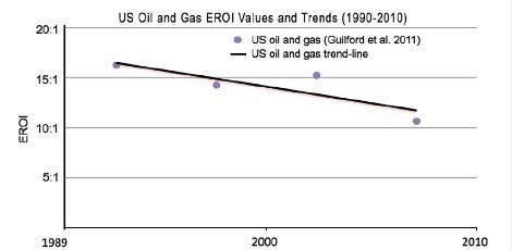
EROI values for our most important fuels, liquid and gaseous petroleum, tend to be relatively high. World oil and gas has a mean EROI of about 20:1 (n of 36 from 4 publications) (Fig. 2) (see Lambert et al., 2012 and Dale, 2010 for references). The EROI for the production of oil and gas globally by publicly traded companies has declined from 30:1 in 1995 to about 18:1 in 2006 (Gagnon et al., 2009). The EROI for discovering oil and gas in the US has decreased from more than 1000:1 in 1919 to 5:1 in the 2010s, and for production from about 25:1 in the 1970s to approximately 10:1 in 2007 (Guilford et al., 2011). Alternatives to traditional fossil fuels such as tar sands and oil shale (Lambert et al., 2012) deliver a lower EROI, having a mean EROI of 4:1 (n of 4 from 4 publications) and 7:1 (n of 15 from 15 publication) (Fig. 2). It is difficult to establish EROI values for natural gas alone as data on natural gas are usually aggregated in oil and gas statistics (Gupta and Hall, 2011 and Murphy and Hall, 2010).

Full-size image (15 K)

Fig 2. Mean EROI (and standard error bars) values for thermal fuels based on known published values. Values are derived using known modern and historical published EROI and energy analysis assessments and values published by Dale (2010). See Lambert et al. (2012) for a detailed list of references. Note: please see text for discussion as all these values should not necessarily be taken at face value.

The other important fossil fuel, coal, has a relatively high EROI value in some countries (U.S. and presumably Australia) and shows no clear trend over time. Coal internationally has a mean EROI of about 46:1 (n of 72 from 17 publications) (see Lambert et al., 2012 for references) (Fig. 2). Cleveland et al. (2000) examined the EROI values for coal production in the United States. They found a general decline from an approximately 80:1 EROI value during the mid 1950s to 30:1 by the middle of the 1980s. Coal, however, regained its former high EROI value of roughly 80:1 by 1990. This pattern may reflect an increase in less costly surface mining. The energy content of coal has been decreasing even though the total tonnage has continued to increase (Hall and Klitgaard, 2012). This is true for the US where the energy content (quality) of coal has decreased while the quantity of coal mined has continued to increase. The maximum energy from US coal seems to have occurred in 1998 (Hall et al., 2009 and Murphy and Hall, 2010).

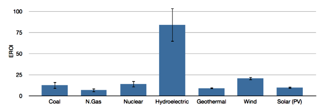
Meta-analysis of EROI values for nuclear energy suggests a mean EROI of about 14:1 (n of 33 from 15 publications) (see Lambert et al., 2013 for references) (Fig. 3). Newer analyses need to be made as these values may not adequately reflect current technology or ore grades. Whether to correct the output for its relatively high quality is an unresolved issue and a quality correction for electricity appears to contribute to the relatively high value given here.

Mean EROI of published papers

Fig 3. Mean EROI (and standard error) values for known published assessments of power generation systems. Values derived using known modern and historical published EROI and energy analysis assessments and values published by Dale (2010). See Lambert et al. (2012) for detailed list of references. Note: please see text for discussion as all these values should not necessarily be taken at face value.

Hydroelectric power generation systems have the highest mean EROI value, 84:1 (n of 17 from 12 publications), of electric power generation systems (see Lambert et al., 2012 for references) (Fig. 3). The EROI of hydropower is extremely variable although the best sites in the developed world were developed long ago (Hall et al., 1986).

We calculate the mean EROI value for ethanol from various biomass sources using data from 31 separate publications covering a full range of plant-based ethanol production (e.g. EROI of 0.64:1 Pimentel and Patzek, 2005 for ethanol produced from cellulose from wood to EROI of 48:1 for ethanol from molasses in India (Von Blottnitz and Curran, 2007)). These values result in a mean EROI value of roughly 5:1 with an n of 74 from 31 publications (Fig. 2). It must be noted, however, that many of the EROI figures (33 of the 74 values) are below a 5:1 ratio (see Lambert et al., 2012 for references) and diesel from biomass is also quite low (2:1 with an n of 28 from 16 publications) (see Lambert et al., 2012 for references). The average is skewed in a positive direction by a handful of outliers (four EROI figures are above 30:1) (Von Blottnitz and Curran, 2007 and Yuan et al., 2008 in Dale, 2010). We believe that outside certain conditions in the tropics most ethanol EROI values are at or below the 3:1 minimum extended EROI value required for a fuel to be minimally useful to society.

Wind power has a high EROI value, with the mean perhaps as high as 18:1 (as derived in an existing meta-analysis by Kubiszewski et al., 2010) or even 20:1 (n of 26 from 18 publications) (see Lambert et al., 2012 for references) (Fig. 3). The value in practice may be less due to the need for backup facilities.

An examination of the EROI literature on solar photovoltaic or PV energy generation shows differences in the assumptions and methodologies employed and the EROI values calculated. The values, assumptions, and parameters included are often ambiguous and differ from study to study, making comparisons between PV and other energy EROI values difficult and fraught with potential pitfalls. Nevertheless, we calculated the mean EROI value using data from 45 separate publications spanning several decades. These values resulted in a mean EROI value of roughly 10:1 (n of 79 from 45 publications) (see Lambert et al., 2012 for references) (Fig. 3). It should be noted that several recent studies that have broader boundaries give EROI values of 2 to 3:1 (Prieto and Hall, 2012, Palmer, 2013 and Weissbach et al., 2013), although these are not weighted for the higher quality of the electricity when compared with thermal energy input. Geothermal electricity production has a mean EROI of approximately 9:1 (n of 30 from 11 publications) (see Lambert et al., 2012 for references) (Fig. 3).

A positive aspect of most renewable energies is that the output of these fuels is high quality electricity. A potential draw back is that the output is far less reliable and predictable. EROI values for PV and other renewable alternatives are generally computed without converting the electricity generated into its “primary energy-equivalent” (Kubiszewski et al., 2009) but also without including any of the considerable cost associated with the required energy back-ups or storage. EROI calculations of renewable energy technology appear to reflect some disagreement on the role of technological improvement. Raugei et al. (2012) attribute some low published EROI values for PVs to the use of outdated data and direct energy output data that represents obsolete technology that is not indicative of more recent changes and improvements in PV technology (Raugei et al., 2012). EROI values that do reflect technological improvements are calculated by combining “top-of-the-line” technological specifications from contemporary commercially available modules with the energy output values obtained from experimental field data. Other researchers contend that values derived using this methodology do not represent adequately the “actual” energy cost to society and the myriad energy costs associated with this delivery process. For example Prieto and Hall, 2012 calculated EROI values that incorporate most energy costs, with the assumption that where ever money was spent energy too was spent. They use data from existing installations in Spain, and derived EROI values of roughly 2.4:1, considerably lower than many less comprehensive estimates. Similarly low EROI values for roof top PVs with battery back up were found by Palmer (2013), although it should be noted that the outputs of both systems were higher quality electricity. Nearly all renewable energy systems appear to have relatively low EROI values when compared with conventional fossil fuels. A question remains as to the degree to which total energy costs can be reduced in the future, but as it stands most “renewable” energy systems appear to be still heavily supported by fossil fuels. Nevertheless they are considerably more efficient at turning fossil fuels into electricity than are thermal power plants, although it takes many years to get all the energy back.

3. Methodology

We summarize existing studies of EROI while attempting to understand the differences among them. Specifically, published values of EROI for similar fuels sometimes are substantially different leading to large differences within the published data for EROI assessments. To reduce these differences Murphy et al. (2011) derived a “standard protocol” for calculating EROI. While recognizing the uncertainties involved in, and inherent to, all EROI calculations, Murphy et al. (2011) proposed that these differences largely can be reduced when similar boundaries are used for the assessment. The generation of EROI values is best developed using industry- or government-derived data on energy outputs and energy costs in physical units, or by using a “process energy method” based on measured energy costs of components. But, more commonly part or all of the data is only in financial units. Energy cost values can be derived from financial costs that can be translated into energy costs using energy intensities (i.e. energy used per monetary unit for that type of activity). Unfortunately, most companies consider their costs proprietary knowledge.

Different boundaries and variables differ between nations and may result in conflicting or inconsistent data (Lambert et al., 2013). Only a few countries, including the US, Canada, the UK, Norway, and China keep the necessary industry-specific estimates of energy costs required to perform an EROI analysis. Fortunately, this data, taken as a whole and within a given country, seems to be relatively consistent with information available from various non-governmental sources e.g. Gagnon et al. (2009), or the differences make logical sense. A short description of our methodology for each respective fuel follows.

3.1. Oil and gas

Oil and gas EROI values are typically aggregated together. The reason is that since both often are extracted from the same wells, their production costs (capital and operations) are typically combined, and therefore the energy inputs for EROI calculations are very difficult to separate. Obtaining reliable data on global petroleum production and its associated investment costs can be very difficult since most production is from national oil companies, whose records tend not to be public. Gagnon et al. (2009) estimated global oil and gas EROI from 1992 to 2006 using data from most publicly-traded oil companies summarized by John Herold Company. Cleveland et al., 1984; Hall et al., 1986 and Guilford et al., 2011 used time series data for oil and gas production in the US from several sources (mostly the U.S. Energy Information Agency and Census of Mineral Industries) going back to 1919. Relatively good time series data is available for Norway (Grandell et al., 2011), Mexico (Ramirez, in preparation), Canada (Freise, 2011 and Poisson and Hall, 2013) and China (Hu et al., 2011 and Hu et al., 2013).

3.2. Coal

We evaluate the EROIST for US and Chinese coal, two of the world’s largest producers. For both nations direct energy gains and costs were derived in physical and energy units available from government sources (Balogh et al., 2012 and Hu et al., 2013). In the U.S. analysis, direct energy consumption and indirect costs were derived from physical and financial data published in the U.S. Census of Mineral Industries and the U.S. Economic Census reports (various years, 1919 through 2007). Direct energy consumption was converted from physical units to joules, and the energy equivalent of the indirect monetary costs was derived using the average energy intensity for the entire economy for a given year multiplied by the nominal dollar cost. A sensitivity analysis (for China) was derived using the energy intensity for all “engineering” sectors (see Hu et al., 2013 for details).

4. Results

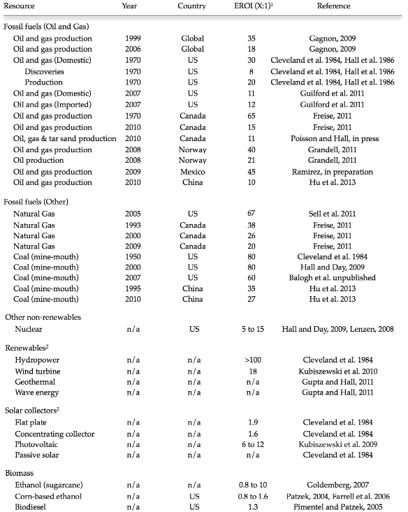
EROI for various fuels varies from 1:1 to 100:1 with, in general, the highest values being for coal in the US and oil and gas from 1970 to 1990. There is a tendency for EROI for oil and gas production to increase during earlier years of development and then decline over time and with rate of exploitation. We organized existing published and unpublished EROI values by fuel type, year and individual study. This information, presented in Table 1, summarizes our existing knowledge of EROIs for various energy sources by EROI value, geographic region, and time.

Table 1. Published EROI values for various fuel sources and regions (adapted from Murphy et al. (2011). (1) EROI values in excess of 5:1 are rounded to the nearest whole number. (2) EROI values are assumed to vary based on geography and climate and are not attributed to a specific region/country

4.1. Global oil and gas (Petroleum)

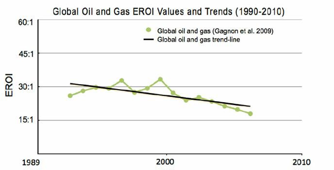
The EROI for petroleum  production appears to be declining over time for every place we have data. Gagnon et al. (2009) were able to generate an approximate “global” EROI for private oil and gas companies using the “upstream” financial database maintained and provided by John H. Herold Company. These results indicate that the EROI for publicly-traded global oil and gas was approximately 23:1 in 1992, 33:1 in 1999 and 18:1 in 2005 (Fig. 4). This “dome shaped” pattern seems to occur wherever there is a long enough data set, perhaps as a result of initial technical improvements being trumped in time by depletion.

fig 4 global oil and gas EROI values and trends 1990-2010

Fig. 4. Gagnon et al. (2009) estimated the EROI for global publicly traded oil and gas. Their analysis found that EROI had declined by nearly 50% in the last decade and a half. New technology and production methods (deep water and horizontal drilling) are maintaining production but appear insufficient to counter the decline in EROI of conventional oil and gas.

4.1.1. United States oil and gas

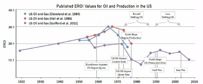
Three independent estimates of EROI time series for oil and gas production for the United States are given in Fig. 5 along with some important oil-related historical events (Cleveland et al., 1984, Hall et al., 1986 and Guilford et al., 2011).

fig 5 published EROI values for oil and production in the US


Fig 5. Time series analyses of oil and gas production within the US including several relevant “oil related” historical events. Each analysis demonstrates a pattern of general increase then decline in EROI with an additional impact of increased exploration/drilling.

The data show a general pattern of increase and then decline in EROI over time except as impacted by changes in exploration (drilling) intensity (in, for example, the late 1970s and early 1980s). During the mid 1970s–1980s and late 2000s, the price of oil increased as did exploration intensity, as measured by increased feet drilled and energy used. EROI values tend to decline when there is an increase in the energy required for exploration and drilling. But, usually increased drilling was linked to little or no additional oil discoveries; hence EROI values declined (Fig. 6). The greatly increased amount of money being spent for oil and gas development in the US in recent years suggests that despite the recent increases in production the EROI may continue to decline.

fig 6 US Oil and Gas EROI Values and trends 1990-2010


Fig 6. US oil and gas values published by Guilford et al. (2011) from 1992 to 2007.

4.1.2. Canadian oil and gas

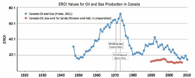
Two independent EROI estimates for Canadian production of oil and gas (blue line, from Freise, 2011) (Fig. 7) and oil, gas and tar sands combined (red line, from Poisson, in press) demonstrate that the EROI of conventional oil and gas in Canada has declined considerably in recent decades. Freise (2011) estimates the EROI of western Canadian conventional oil and gas over time from 1947 to 2010. Freise agrees with Poisson that the later values are probably more accurate.

fig 7 EROI values for oil and gas production in Canada

Fig 7. Two independent estimates of EROI for Canadian petroleum production: oil and gas (blue line, from Freise, 2011) and oil, gas and tar sands combined (red line, from Poisson and Hall, in press). (For interpretation of the references to color in this figure legend, the reader is referred to the web version of this article.)

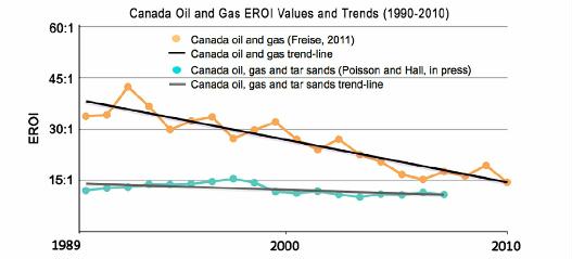
Poisson and Hall (in press) found that the EROI of conventional oil and gas has decreased since the mid-1990s from roughly 20:1 to 12:1, a 40% decline. The EROI of conventional combined oil–gas–tar sands has also decreased during this same period from 14:1 to 7.5:1, a decline of 46% (Fig. 8) (Poisson and Hall (in press)). Poisson and Hall’s estimated EROI values for Canadian oil and gas are about half those calculated by Freise and their rate of decline is somewhat less rapid (Freise, 2011 and Poisson and Hall, 2013) (Fig. 8).

fig 8 canada oil and gas EROI values and trends 1990-2010


Fig 8. Canada oil and gas and oil, gas and tar sand values by Freise (2011) and Poisson and Hall (in press).

Poisson and Hall’s estimate of the EROI of tar sands is relatively low, around 4.5 (a conservative (i.e. high) estimate, using only the front end of the life-cycle); incorporating tar sands into total oil and gas estimates decreases the EROI of the oil and gas extraction industry as a whole (Poisson and Hall, in press). These estimates would be lower if more elements of the full life-cycle (e.g. environmental impact) were included in the calculation.

4.1.3. Norwegian oil and gas

Norwegian conventional oil and gas fields are relatively new and remain profitable both financially and with regard to energy production. Grandell et al. (2011) estimate that the EROI of oil and gas ranged from 44:1 (during the early 1990s) to 59:1 (1996), to approximately 40:1 (during the latter half of the last decade) (Fig. 9) (Grandell et al., 2011).

fig 9 new assessments of EROI for oil and gas from various countries


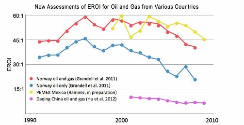
Fig 9. Time series data on EROI for oil and gas for Norway, Mexico and the Daqing oil field in China based on several papers published in the 2011 special issue of the journal Sustainability and works in progress.

4.1.4. Mexican oil and gas

Ramirez’s trends for the EROI of Mexican oil and gas suggest that this country may have peaked twice in the past decade. The EROI for conventional oil and gas production in Mexico declined from roughly 60:1 in 2000 to 47:1 the following year, but returned to 59:1 by about 2003 (Fig. 9) (Ramirez, in preparation). This was followed by a steady decline over the following six years reaching 45:1 by 2009. The collapse of production from the Cantarell field in the Gulf of Mexico, once the world’s second largest, appears largely responsible for this decline.

4.1.5. Chinese oil and gas

The EROI for the Daqing field, China’s largest conventional oil field, has declined continuously from 10:1 in 2001 to 6:1 in 2009 (Fig. 9) (Hu et al., 2011).

4.2. Dry natural gas

The data represented in Fig. 10 includes analyses for a portion of the US and for all of Canada. Since most published numbers combine data on natural gas with that of oil, it is usually difficult or impossible to assess the production costs of these fossil fuel resources independently. Sell et al.’s (2011) trends for EROI of natural gas in Pennsylvania (US) has an undulating decline; from roughly 120:1 in 1986 to 67:1 in 2003. This value is probably a high value as some important indirect costs were not included. Freise (2011) estimated the EROI of western Canadian natural gas from 1993 to 2009 and found that the EROI of natural gas has been decreasing since 1993 through 2006, from roughly 38:1 to 14:1. This trend shifted in 2006 as exploitation intensity declined resulting in a steady increase and an EROI of roughly 20:1 by 2009 (Fig. 10) (Freise, 2011). Aucott and Melillo (2013) found values similar to Sell et al. for “fracked” shale gas from Pennsylvania from, presumably, “sweet spots”.

fig 10 published EROI values for natural gas

Fig 10. Two published studies on the EROI of dry (not associated with oil) natural gas: Sell et al. (2011) examined tight natural gas deposits in western Pennsylvania in the US, and Freise (2011) analyzed all convention natural gas wells in western Canada.

4.3. Coal

The only EROI analyses for coal production are from the US and China because information on the energy expended to extract coal in other areas of the world appears unavailable. Time series of EROI for coal production for the United States and China are given in Fig. 11. A great deal of variability in EROI is evident in these figures. This data, however, have significant holes (e.g. no data is reported for approximately 30 years, from the mid 1950s to the mid 1980s). Cleveland’s work provides additional information for three noncontiguous years that is only partly consistent with Balogh et al.’s findings. Hu et al. (2013) establishes annual data for Chinese coal production for the years 1994 through 2009. These show very little variation in EROI values.

fig 11 EROI values for coal

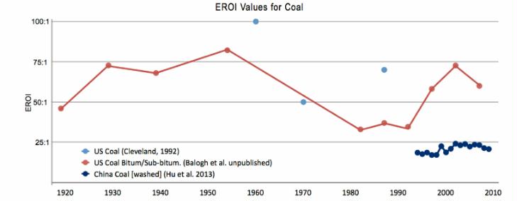
Fig 11. EROI for US and Chinese coal production derived from Cleveland (1992), Balogh et al. (unpublished data) and Hu et al. (2013).

5. Research challenges

There are four major challenges for calculating the EROI of various fuels at the national, regional and global scale.

First is the lack of data on fuel used during the extraction process. Data on on-site non-traded fuels generally is not readily available, although ideally they are reported to government agencies undertaking census work. Often indirect energy cost calculations must be derived from financial data. This requires converting currency into an energy equivalent (e.g. mega joules used per dollar of GDP). Methods for accomplishing this conversion usually assume that expenditure for inputs to the energy industry are the same as for society more generally or for an engineering component. They may be less accurate but sensitivity analyses can be undertaken to address uncertainties. Ideally Input–output analysis is undertaken which can give much more accurate results. This analysis used to be done by a team at the University of Illinois but these results are seriously outdated. A more recent analysis may have been done at Carnegie-Mellon’s Green Building Program, from which useful general values can be obtained (See Prieto and Hall, 2012, chapter 4).

Second is the issue of variation in scale. Are studies at the regional level comparable to those at the national level and how do these “size up” when presented next to “international” studies that include a small subset of representative countries? Various variables and boundaries often vary with the scale of investigation making it difficult to compare data among diverse analyses.

Third, energy analysts are not in agreement on what indirect costs should and should not be included in an EROI assessment. When complete systems are analyzed for solar PV installations, their financing, their operations and maintenance costs and their backups are included the energy costs are about three times larger than for just the modules and inverters. One very contentious indirect cost is the inclusion or exclusion of the energy cost of supporting human labor (Murphy et al., 2011). This can result in varying and potentially controversial assessments especially when assessing fuels where small differences may determine whether that fuel is perceived as a viable energy option (e.g. corn-based ethanol).

Fourth, is that the quality or utility of these various fuels is represented differentially within different data sets. Total primary energy consumption values at the global level published by the U.S. Energy Information Agency, International Energy Agency (IEA), and BP (Hayward, 2010); Smil, 2008, tend to be similar. They occasionally vary, however, in their method of addressing “primary energy” conversion. For example, EIA data includes the heat generated by nuclear power in its energy output assessments. Various researchers, government agencies and industry organizations present data from a variety of sources using various assessments, e.g. national (EIA), global (IEA) and industrial (BP). Laherrère addressed this issue at the 2011 ASPO conference (Laherrère, 2011). He also noted that IEA data is presented as the direct electricity generated for nuclear and hydropower, while EIA data includes waste heat produced by nuclear fission.

There is a broadly consistent pattern to our results, as indicated by the similar temporal patterns of different studies, all of which (except coal) have declined over time (and with increased effort) and by the fact that regions developed for oil and gas for a longer period (e.g. US, China or anywhere over time) have lower EROIs, while newer developments (e.g. Norway) tend to have higher values. If and as the Murphy et al. (2011) protocol is more universally followed we expect even greater consistency in results.

6. Discussion

Our research summarizes EROI estimates for all industrial fuels, and for the three major fossil fuels, coal, oil and natural gas over time. These initial estimates of general trends in EROI provide us with a beginning on which we and others can build as additional and better data become available.

6.1. Historical perspective (1900–1939)

The industrial revolution was in full swing by the early 1900s (Fig. 2). Abundant high quality coal from relatively thick seams (with high EROI), capable of generating an enormous amount of energy, was harnessed by humans to do all kinds of economic work including: heating, manufacturing, the generation of electricity and transportation. Biomass energy, in the form of wood burning for domestic use (heating and cooking), remained an important contributor to the world’s energy portfolio (Perlin, 1989). During this period the oil industry was in its infancy and was primarily used for transportation and lighting (in the form of kerosene in non-urban/non-industrial regions). High quality oil remained a small contributor to the energy mix until the end of the 1930s although it was increasing rapidly on a global scale (Hall and Klitgaard, 2012).

6.2. Historical perspective (1940–1979)

The massive WWII war effort during the 1940s saw increased use of coal and oil for the manufacture and use of war machinery. During the post-war era, the great oil discoveries of the early twentieth century found a use in global reconstruction and industrialization. Throughout the 1950s and 1960s the repair of war-torn Europe and the proliferation of western culture resulted in massive increases in the manufacturing and transport of goods and the oil necessary for their production and use. By the late 1960s the EROI of coal (mostly from deep mines) began to decline while the EROI of oil remained high. The EROI for coal production in the US declined from 80:1 in the 1950s to 30:1 in the 1970s (Cleveland et al., 1984). During this time period, coal was mined almost exclusively in the Appalachian mountain region areas of the US using a combination of room and pillar mines with conventional and continuous mining methods. The coal initially extracted from these locations was a combination of anthracite and high quality bituminous coal, coal with high BTUs/ton. As the best coal was used first, the EROI for coal decreased over time.

The quality of coal being produced was decreasing while world oil production was increasing. The peak of US oil production in 1970 and subsequent peak of US conventional natural gas in 1973 meant an increased reliance on OPEC oil. Increases in oil prices reflected in part increased energy required to purchase this fuel. The price of other economic activities increased at similar rates (Hall and Klitgaard, 2012). After the oil shocks of the 1970s, oil prices surged in the US and around the world, stimulating both increased drilling activity and greater interest in the exploitation of more marginal resources (those with higher production costs) (Guilford et al., 2011). Increased drilling activity in the U.S. did not result in increased production but caused a sharp decline in the EROI for conventional oil and gas for the US between the early 1970s and mid 1980s. The oil shocks of the 1970s temporarily halted a long period of increased oil use. It also generated a global oil market and price, destroying an advantage once held by the US. Recovery of production did not occur in the continental US where oil production had declined since its peak in 1970; until the rather recent uptick in 2008 following the introduction of the “new” technologies of horizontal drilling and hydraulic fracturing. New work on the EROI for oil and gas produced by horizontal drilling and rock fracturing indicate that the EROI can be very high, in part because it is not necessary to pressurize the fields (e.g. Aucott and Mellilo 2013; Moeller and Murphy personal communication; Waggoner personal communication) but that these high values are likely to decline substantially as production is moved off the “sweet spots”.

6.3. Historical perspective (1980–2009)

In the 1980s post “energy price shock” era, oil that had been found but not developed suddenly became worthy of developing. Many world oil resources, incentivized by higher prices, were developed; some were over developed. Important gains in oil and gas production occurred in some non-OPEC countries including Norway, Mexico, and China. Heating and transportation, historically fueled by coal, was transformed to oil and gas. Energy from coal production shifted to, and remained essential to, manufacturing and increasingly the production of electricity. The EROI of US coal returned to 80:1 by about 1990. This pattern reflects a shift in the quality of coal extracted, the technology employed in the extraction process and especially the shift from underground to surface mining. A shift in mining location, from Appalachia to the central and northern interior states of Montana and Wyoming and extraction method, from underground to surface mining (area, contour, auger, and mountain top mining techniques) have resulted in less energy required to mine and beneficiate coal. The energy content of the coal extracted, however, has decreased. The coal currently mined is lower-quality bituminous and sub-bituminous coal with much lower BTUs/ton (Hall et al., 1986 and Hall and Klitgaard, 2012) The increased efficiency of surface mining seems to just about compensate for the decline in the quality of the coal mined. See Section 7 for a consideration of environmental externalities.

Between 1985 and the early 1990s international oil and gas prices fell, then remained stable until 2000 while drilling effort declined until the mid 2000s. Thus the 1990s was a period of abundant oil and plummeting oil prices bringing the real cost of oil back to that of the early 1970s (Hall and Klitgaard, 2012). Discretionary spending in the US and other western nations, often on housing, increased. The late 1990s was a time of reduced oil exploration efforts apparently resulting in an increase in EROI. The mid 2000s marked an increase in global oil and gas exploration efforts (Smil, 2008). Discretionary spending decreased with the energy price increases from 2007 to the summer of 2008. Oil prices hit an all time high of $147 per barrel in the summer of 2008 (Read, 2008). This extra 5–10% “tax” from increased energy prices was added to the US (and other) economy as it had been in the 1970s, and much discretionary spending disappeared (Hall et al., 2008). Speculation in real estate (in the US) was no longer desirable or possible as consumers tightened their belts because of higher energy costs (Hall and Klitgaard, 2012). The stock market crashed in September 2008 reducing market value by $1.2 trillion and forcing the Dow to suffer its “biggest single-day point loss ever” (Twin, 2008), and most Western economies have essentially stopped growing since. In general there has been a decade-by-decade decline in growth of the US economy since 1935, in step with the decline in the annual rate of change for all oil production liquids globally (Hall et al., 2012). Even though the global EROI for producing oil and gas continues to be reasonably high, it is probable that the EROI of oil and gas will continue to decline over the coming decades (Gagnon et al., 2009). The continued pattern of declining EROI diminishes the importance of arguments and reports that the world has substantially more oil remaining to be explored, drilled and pumped. “High” EROI values for oil and gas production are increasingly attributable to the inclusion of high EROI natural gas (e.g. the EROI of Norwegian oil is about half that for oil and gas combined) (Grandell et al., 2011). The recent declining trend is described by Grandell et al. as probably due to “aging of the fields.” It is likely that varying drilling intensity has had minimal impact on the net energy gain of these fields. Grandell et al. (2011) expects the EROI of Norwegian oil and gas production “to deteriorate further as the fields become older”. Meanwhile, China’s use of oil has expanded enormously so that China has been importing a larger and larger proportion of its oil from the rest of the world. Recently, China has increased its oil exploitation efforts tremendously, both inside and outside of China. Even so, Hu et al. (2011) suggest that China appears to be approaching its own peak in oil production. Since 2008 producers have shifted increasingly to non-conventional oil and gas resources (tar sands, shale oil and gas) which have increased production but also costs. New technologies such as horizontal drilling and hydro-fracturing are currently keeping the total levels of non-conventional and conventional natural gas production in the US at rates similar to those of 1973 from conventional natural gas alone. Given the numerous shifting environmental variables and social issues surrounding horizontal drilling and “fracking”, it is difficult to predict the future of non-conventional oil and gas (Hall and Klitgaard, 2012).

Already some areas of production from the Barnett and Haynesville formations appear to have reached a production plateau (Hughes, 2013). Recent analyses by Hughes (2013) argue against assuming production will continue to increase. Much of the discussion about “peak coal” (e.g. Patzek and Croft, 2010) involves changing mining technology and capacity, rather than the quantity and quality of coal that remains available for extraction. Peak coal will likely have the greatest impact on the world’s largest coal user, China. Nations with abundant untapped coal resources (i.e. the US, Australia and Russia) are likely to be less affected. The total recoverable coal estimated for the US alone is approximately 500 billion tons. US coal production in 2009 was about one billion tons. Although it is difficult to predict future production technology, environmental issues, consumption patterns and changes in EROI, it appears that coal may be abundantly available through the next century.

6.4. Renewable energy sources

Alternative renewable energies lack many of the undesirable characteristics of fossil fuels, including direct productions of carbon dioxide and other “pollutants”, but also lack many of the highly desirable traits of non-renewable fossil fuels. Specifically, renewable energy sources:

• are not sufficiently “energy dense”,
• tend to be intermittent,
• lack transportability,
• most have relatively low EROI values (especially when corrections are made for intermittency), and
• currently, lack the infrastructure that is required to meet current societal demands.

If we were to replace traditional nonrenewable energy with renewables, which seems desirable to us in the long run, it would require the use of energy-intensive technology for their construction and maintenance. Thus it would appear that a shift from non-renewable to renewable energy sources would result in declines in both the quantity and EROI values of the principle energies used for economic activity.

Although wind, apparently relatively favorable from an EROI perspective and photovoltaic (PV) energy, are currently the world’s fastest growing renewable energy sources, they continue to account for less than one percent of the global energy portfolio (REN21, 2012). Nevertheless there are many informal reports of PV reaching “price parity” with fossil fuels and to many the future of PV is very bright.

Proponents of EROI assessments using actual operational installations (rather than laboratory estimates) believe that, in order to portray renewable energy technology accurately, it is necessary to make note of the fact that these technologies are dependent upon (i.e. constructed and maintained using and therefore subsidized by) high EROI fossil fuels.

Higher EROI values found in conceptual studies often result from assumptions of more favorable conditions (within simulations) than those actually experienced in real life.

For example, English wind turbines were found to operate considerably fewer hours per month than anticipated (Jefferson, 2012).  Kubiszewski et al. (2010) infer that variations in EROI values, in the case of reported EROI values for wind energy, (between process and input output analyses) stems from a greater degree of subjective system boundary decision-making by the process analyst, resulting in the exclusion of certain indirect costs. Other researchers believe that the focus of EROI assessments must be on net energy produced from existing installations and variables associated with wind and PV modules once they have entered the infrastructure rather than extrapolating into the future. Examination of concrete input and output data from operational facilities, e.g. wind turbines (Kubiszewski et al., 2010), appears to offer the best opportunity to calculate wind and PV EROI values accurately.

Also of concern is that wind and PV technology are not “base load technologies”, meaning that future large scale deployment, beyond 20 percent of the grid capacity, will likely require the construction of large, energy intensive storage infrastructures which, if included within EROI assessments, would likely reduce EROI values considerably. In the case of wind, the cost for inclusion within a wind EROI analysis requires not only the initial capital costs per unit output but also the backup systems required for the 70 or so percent of the time when insufficient wind is blowing. Thus, the input for an EROI analysis of wind and PV technology is by and large “upfront” capital costs. This is in sharp contrast to the less well known “return” over the lifespan of the system. Therefore, a variable referred to as “energy payback time” is often employed when calculating the EROI values of wind and other renewable energy sources. This is the time required for the renewable energy system to generate the same amount of energy that went into the creation, maintenance, and disposal of the system. The boundaries utilized to define the energy payback time are incorporated into most renewable EROI calculations. Other factors influencing wind and PV EROI values include energy storage, grid connection dynamics and variations in construction and maintenance costs associated with the installation location. For example, off-shore turbines, while located in wet salty areas with more reliable energy-generating winds, require replacement more often. Turbines located in remote mountainous areas require long distance grid connections that result in energy loss and reduced usable energy values (Kubiszewski et al., 2010).

7. Policy implications

In conclusion, the EROI for the world’s most important fuels, oil and gas, has declined over the past one to two decades for all nations examined. It remains possible that the relatively high EROI values for the natural gas extracted during, and often used for, the production of oil may mask a much steeper decline in the EROI of oil alone. Declining EROI is probably already having a large impact on the world economy (Murphy and Hall, 2010 and Tverberg, 2012). As oil and gas provide roughly 60–65% of the world’s energy, this will likely have enormous economic consequences for many national economies.

Coal, although abundant, is very unevenly distributed, has large environmental impacts and has an EROI that depends greatly on the region mined. A general decline in the energy content of US coal resource over time may be compensated by a shift from energy-intensive underground mining of relatively high quality (but declining) Eastern US coal resources to lower-cost surface mining of lower energy-content Western US coal resulting in no clear trend in EROI for coal.

The decline in EROI among major fossil fuels suggests that in the race between technological advances and depletion, depletion is winning. Past attempts to rectify falling oil production i.e. the rapid increase of drilling after the 1970 peak in oil production and subsequent oil crises in the US only exacerbated the problem by lowering the net energy delivered from US oil production (Hall and Cleveland, 1981). Increasing prices, thought by most economists to negate depletion through increasing incentives for exploitation, cannot work as EROI approaches 1:1, and even now has made oil too expensive to support the high economic growth it once did.

It would be tempting, from a net energy perspective, to recommend that we replace fossil fuels with renewable energy technologies as the EROI for fossil fuel falls to a level where these technologies become competitive. While EROI analyses generate numerical assessments using quantitative data that include many production factors, they do not include other important data such as climate change, air quality, health benefits, and other environmental qualities that are considered “externalities” to these analyses. The energy intensive carbon capture and sequestration (CCS) required to reduce fossil fuel emissions to levels equivalent with that of wind or PV electricity production would reduce the final coal EROI value considerably ((e.g. Akai et al. 1997 in Dale, 2010 and Lund and Biswas, 2008).

EROI figures do not take into account the high life-cycle greenhouse gas emissions from thermal electricity production, and coal-fired systems in particular (Raugei et al., 2012). This could, with difficulty, be worked into future, more comprehensive EROI calculations. Most alternative renewable energy sources appear, at this time, to have considerably lower EROI values than any of the non-renewable fossil fuels. Wind and photovoltaic energy are touted as having substantial environmental benefits. These benefits, however, may have lower returns and larger initial carbon footprints than originally suggested (e.g. the externalities associated with the mining of neodymium and its subsequent use in wind turbine construction). The energy costs pertaining to intermittency and factors such as the oil, natural gas and coal employed in the creation, transport and implementation of wind turbines and PV panels may not be adequately represented in some cost-benefit analyses. On the positive side, the fact that wind and PV produce high quality electricity needs to be considered as well.

Thus society seems to be caught in a dilemma unlike anything experienced in the last few centuries. During that time most problems (such as needs for more agricultural output, worker pay, transport, pensions, schools and social services) were solved by throwing more technology investments and energy at the problem. In many senses this approach worked, for many of these problems were resolved or at least ameliorated, although at each step populations grew so that more potential issues had to be served. In a general sense all of this was possible only because there was an abundance of cheap (i.e. high EROI) high quality energy, mostly oil, gas or electricity. We believe that the future is likely to be very different, for while there remains considerable energy in the ground it is unlikely to be exploitable cheaply, or eventually at all, because of its decreasing EROI. Alternatives such as photovoltaics and wind turbines are unlikely to be nearly as cheap energetically or economically as past oil and gas when backup costs are considered. In addition there are increasing costs everywhere pertaining to potential climate changes and other pollutants.

Any transition to solar energies would require massive investments of fossil fuels.

Despite many claims to the contrary—from oil and gas advocates on the one hand and solar advocates on the other—we see no easy solution to these issues when EROI is considered.

If any resolution to these problems is possible it is probable that it would have to come at least as much from an adjustment of society’s aspirations for increased material affluence and an increase in willingness to share as from technology.

Unfortunately recent political events do not leave us with great optimism that such changes in societal values will be forthcoming.

References

    • Aucott, in press
    • Aucott, M. L. and Jacqueline M. Melillo, 2013. A Preliminary Energy Return on Investment Analysis of Natural Gas fromthe Marcellus Shale. Journal of Industrial Ecology 17, 668-679.
    • Balogh et al., 2012
    • Balogh, S.; Guilford, M.; Arnold, S.; Hall, C., unpublished data 2012. EROI of US coal.
    • Dale, 2010
    • M. Dale
    • Global Energy Modeling: A Biophysical Approach (GEMBA)
    • University of Canterbury, Christchurch, New Zealand (2010)
    • Hall et al., 1986
    • C. Hall, C. Cleveland, R. Kaufmann
    • Energy and Resource Quality: the Ecology of the Economic Process
    • Wiley, New York, USA (1986)
    • Hall et al., 2008
    • C. Hall, R. Powers, W. Schoenberg
    • Peak oil, EROI, investments and the economy in an uncertain future
    • D. Pimentel (Ed.), Renewable Energy Systems: Environmental and Energetic Issues, Elsevier, London, UK (2008), pp. 113–136
    • |

    • Hall and Klitgaard, 2012
    • C. Hall, K. Klitgaard
    • Energy and the Wealth of Nations: Understanding the Biophysical Economy
    • Springer Publishing Company, New York, USA (2012)
    • Hayward, 2010
    • T.BP Hayward
    • Statistical Review of World Energy
    • British Petroleum, London, UK (2010)
    • Hamilton, 2009
    • Hamilton, J., 2009. Causes and Consequences of the Oil Shock of 2007–2008. Brooking Papers on Economic Activity, Spring, 215–283.
    • Lambert and Lambert, 2013
    • Lambert, J., Lambert, G., 2013. Life, Liberty, and the Pursuit of Energy: Understanding the Psychology of Depleting Oil Resources. Karnak Books: London, UK, (in preparation).
    • Lambert et al., 2012
    • Lambert, J., Hall, C., Balogh, S., Poisson, A., Gupta, A., 2012. EROI of Global Energy Resources: Preliminary Status and Trends. Report 1 of 2. UK-DFID 59717, 2 November 2012.
    • Lambert et al., 2013
    • J. Lambert, C. Hall, S. Balogh, A. Gupta, M. Arnold
    • Energy, EROI and Quality of Life
    • Energy Policy (2013) (in press)
    • Perlin, 1989
    • J. Perlin
    • A forest journey: the role of wood in the development of civilization
    • W.W. Norton, New York, USA (1989)
    • Poisson and Hall, 2013
    • Poisson, A., Hall, C., 2013. EROI of Canadian Oil and Gas, and Tar Sands, Energies, (in press).
    • Prieto and Hall, 2012
    • P. Prieto, C. Hall
    • EROI of Spain’s Solar Electricity System
    • Springer Publishing Company, New York, USA (2012)
    • Ramirez,
    • Ramirez, P., 2013. The Relation of Oil to the Mexican Economy: Past, Present and Future, (in preparation).
    • Smil, 2008
    • V. Smil
    • Energy in nature and society: general energetics of complex systems
    • The MIT Press, Cambridge, USA (2008)
    • Tainter, 1988
    • J. Tainter
    • The Collapse of Complex Societies
    • Cambridge University Press, Cambridge, UK (1988)
    • Weissbach et al., 2013
    • D. Weissbach, G. Ruprecht, A. Huke, K. Czerski, S. Gottlieb, A. Hussein
    • Energy intensities, EROIs (energy returned on invested), and energy payback times of electricity generating power plants
    • Energy, 52 (2013), pp. e210–e221
Posted in Charles A. S. Hall | Comments Off on Charles A. S. Hall “EROI of different fuels and the implications for society”

Wind turbines hit limits to growth before 50% wind power penetration

Material requirements of 50% wind power in the USA hit limits to growth

Also see:

Davidsson, S., et al. 2014. Growth curves and sustained commissioning modelling of renewable energy Investigating resource constraints for wind energy. Energy Policy.

Fizaine, F., et al. July 2014. Energy transition toward renewables and metal depletion: an approach through the EROI concept. Les Cahiers de la Chaire Economie du Climat.

Wind turbines can’t be made forever because lower grade ores require more and more energy at a time when energy resources are declining.  The natural gas, coal, oil, uranium (thorium), neodymium, and other energy resources and minerals needed for wind turbines are finite.  It takes energy to recycle, and few metals are cycled as much as they ought to be, and some can’t be recycled.

Since wind and solar need to provide the lion’s share of renewable energy in the future, but wind only blows 32 percent of the time nationally, you’d want to build at least three times as many wind turbines to store energy while the wind is blowing for calmer times. Or perhaps even five times overcapacity to cope with the seasonal nature of wind, which is only at 21 percent capacity in August. Plus you’ll need to generate more electricity than in 2014 for the billion people expected by the end of the century, so perhaps six times more.  Or let’s go for seven times more, since endless growth is the solution offered by both political parties as the way out of our economic doldrums, especially “green” growth.

Tripling the number of wind turbines to compensate for the 32% capacity gets you:

5,606 MWh power/year per turbine = 2 MW * .32 capacity * 24 hrs * 365 days

730,099 windmills = 4,092,935,000 MWh /5606 MWh (EIA 2015 1.1) = needed.  Cross-check: NREL estimates that 893,698 1.5 MW turbines are needed for 80% wind penetration by 2020 in class 4 wind, 2 x 40% case = 3914 TWh (NREL 2006)

$2.2 to $2.9 trillion dollars (@ $3 to $4 million per windmill)

This won’t provide 100% of America’s energy because the round-trip efficiency of most energy storage is 80%, wind capacity is 25 percent in summer, wind turbine performance declines over time, non-prime locations will lower the average wind capacity, two to nine percent of electricity is lost over transmission lines, and their lifespan is 20 years, so increasing numbers will need to be replaced or out of commission from repairs.

Area required is 193,933 square miles = (85 acres/MW (NREL 2009) * 2 MW turbines * 730,099). That’s about 72 percent of Texas, or California plus South Carolina, or .66% of the total lower 48 states, but doesn’t include the roads, transmission line and tower corridors, and other equipment.

Material Short Tons Tons for 730,099 2 MW turbines Production in short tons per year
Concrete 1302.35 950,844,433      142,464,000 United States (USGS)
Steel 292.75 213,736,482    1,800,064,000 world-wide (worldsteel)
Iron 48.35 35,300,287
Fiberglass 24.4 17,814,416 1,523,200 (USA 2005 production)
Copper 4.1 2,993,406 20,048,000
Neodymium 0.4 292,400          7,840 world-wide (ED)
Dysprosium 0.065 44,456              112 world-wide (ED)


Materials per 2 MW turbine (average of Guezuraga, USGS). Fiberglass annual production (NREL 2006).

Clearly materials can be imported, more manufacturing built up – but as energy declines and the financial system copes with shrinkage, the opposite of the current borrowing and paying back the money from growth, it’s not clear that ramping up is likely — quite the opposite is possible, with many businesses going bankrupt.

Fiberglass would require 100% of production for 11.7 years.

Materials not included: vehicles, cranes to hoist blades and tower, thousands of miles of transmission lines & towers, substations, utility-scale energy storage, etc.

ED. 2015. Neodymium. Dysprosium. ElementsDatabase.org

EIA. 2015. Table 1.1. Net Generation by Energy Source: Total All Sectors, 2004-December 2014. Energy Information Administration.

EIA. 2015. Table 6.7.B. Capacity Factors for Utility Scale Generators Not Primarily Using Fossil Fuels, January 2008-November 2014. U.S. Energy Information Administration.

Guezuraga, B. 2012. Life cycle assessment of two different 2 MW class wind turbines. Renewable Energy 37:37-44.

NREL. 2006. High Wind Penetration Impact on U.S. Wind Manufacturing Capacity and Critical Resources. National Renewable Energy Laboratory.

Prieto, P. A.  21 Oct 2008. Solar + Wind in Spain/ World. Closing the growing gap? ASPO International conference.

USGS. 2011. Cement production. United States Geological Society. 127,200,000 long tons converted to 142,464,000 short tons (2,000 lbs)

USGS. 2011. Wind Energy in the United States and Materials Required for the Land-Based Wind Turbine Industry From 2010 Through 2030. U.S. Geological Survey.

Worldsteel. 2014. Monthly Crude Steel Production 2014Pig iron 2013 + DR 2013. worldsteel.org (converted from long to short tons).

Posted in Electrification, Limits To Growth, Renewable Integration, Wind | Tagged , , , , , , , , , , , | 2 Comments

Wind’s dirty secret: it goes on vacation in the summer and year-round in the South East

USA summer map 2-14


Figure 1. Summer wind across the USA is barely to not economically viable Class 3 (light blue), or not at all economically viable Class 2 (orange) and class 1 (blank) (NREL), with very limited darker blue (class 4) and tiny dots of higher class 5+ to provide power for the entire US.

Someday wind and solar will need to contribute over 50% of power due to declining fossil fuels and uranium

Is this possible?

Wind (and solar) have to contribute the majority of renewable power, because there isn’t enough potential power from biomass, geothermal, hydropower, or energy storage for reasons discussed further below.

Wind is unpredictable, uncertain, unreliable — off at the pub like a Dickensian father drinking his paycheck anywhere from 57.0% to 78.2% of the time in the United States (EIA), barely blowing in the summer.

Wind power is on vacation all year in the South East

Wind is not available all year at commercially viable speeds (class 3 or above) in the South Eastern United States, where no power is wind-generated now.

Wind power MW AWEA usa map

Figure 2-4. U.S. utility-scale wind power capacity year-end 2013. Source: AWEA. 2014. U.S. Wind Industry Annual Market Report, Year Ending 2013. American Wind Energy Association. http://www.awea.org/amr2013

Figure 2-4. U.S. utility-scale wind power capacity year-end 2013. Source: AWEA. 2014. U.S. Wind Industry Annual Market Report, Year Ending 2013. American Wind Energy Association. http://www.awea.org/amr2013


Across the entire continental United States, wind blows the most and the hardest in winter, mainly in remote states far from dense coastal population centers where the energy is most needed. Will windy states share their wind? Even if they were willing, there’s not a national transmission grid and not likely to ever be one given the cost, 10-12 years to get permits and buy right-of-way, and risk of a national grid outage.

There’s not enough prime and non-prime wind, solar, geothermal, or hydro potential power in the 11 western states of the WECC region of the electric grid to replace existing WECC fossil fuel and nuclear plants.

California’s peak demand is in the summer, when wind blows the least, so the state of California looked at importing Wyoming wind power.  But this would require adding 957 MW of natural gas plants since Wyoming wind isn’t blowing much in the summer either (NREL 2014).

Are there any banks willing to lend utilities, governments, or private businesses trillions of dollars to build tens of thousands of miles of transmission lines costing $5.5 million dollars per mile (BG) to build a national grid first, and then enough wind farms to move winter wind power from windy states to the rest of the nation?  Will states be willing to send power across state lines that they won’t benefit from (which they are already reluctant to do) at a time when they need all the power they can get as fossil fuels decline?

Nearly all wind maps show the yearly average, which is meaningless and misleading. What matters is how much wind there is every hour, every day, every week, every month, every season. Notice below how much wind varies over seasons (EIA 2015b). A tremendous amount of energy storage would be needed to compensate for lack of wind energy over the summer.

wind capacity factor by regions of U.S.


Grid operators care about wind at even smaller time intervals — 10 minutes or less — so that they can quickly curtail wind power when supply exceeds demand or ramp up natural gas plants when wind dies down. The electric grid needs to balance supply and demand within a few percent of 60 Hz, or there’s a black out.

Summer demand in Texas versus wind availability (Lesser)

As you can see below, on average the demand in the summer in Texas is far higher than the wind available.

2009-12, Summer and Annual Load and Wind Availability-ERCOT

2009-12, Summer and Annual Load and Wind Availability-ERCOT


The load-wind gap(Lesser)

We can also evaluate the load-wind “gap” in each season. We define this load-wind “gap” as the difference between the seasonal wind availability ratio and the seasonal load ratio. The seasonal wind availability ratio is defined as the average seasonal wind availability relative to average annual wind availability. Similarly, the seasonal load ratio is defined as the average load during the specific season relative to average annual load. For example, suppose the seasonal load in spring equals 90% of annual average load, but that seasonal wind generation is 120% of annual average wind generation. Then the load-wind “gap” equals 120%-90%, or +30%. A positive load-wind gap value means there is relatively more wind generation available to serve load; a negative load-wind gap value means there is relatively less wind generation available to serve load. Below you can see the seasonal load-wind “gap” for ERCOT, MISO, and PJM over the 2009-2012 period.

As these three figures demonstrate , the relative lack of wind generation in each region during the last four Summers is pronounced. In all three regions, the highest relative amount of wind generation occurred when loads were lowest, and the smallest amounts of wind were available when loads were greatest in Summer. In PJM, the effect has been particularly pronounced, with a summer load-wind gap of almost -70% in summer 2010 and 2011, and -59% in summer 2012. Chicago’s experience during Summer 2012’s searing heat wave provides a compelling local example of wind failure to provide power on the hottest days. During this heat wave, Illinois wind generated less than 5% of its capacity during the record breaking heat, producing only an average of 120 MW of electricity from the over 2,700 MW installed. On July 6, 2012, when the demand for electricity in northern Illinois and Chicago averaged 22,000MW, the average amount of wind power available during the day was a virtually nonexistent 4 MW (J. Lesser, “Wind Power in the Windy City: Not There When Needed” Energy Tribune op-ed, July 25, 2012).

load-wind gap ERCOT 2009-2012 load-wind gap MISO 2009-2012 load-wind gap PJM 2009-2012


It’s not okay for wind to disappear 68% of the time, because the electric grid needs to be up 24 x 7 for computers, finance, credit cards, banks, cash registers, refrigeration; to pump sewage, drinking and irrigation water; for agriculture, food processing and packaging, radios, cellphones, refineries, heat and air conditioning, hospitals, pharmacies, police, fire, etc. Vehicles depend on electricity to pump fuel and make gas or diesel at refineries.

The more wind energy contributes to overall power, the less it can be counted on.  This is counter intuitive, but consider that if wind provides only 1% of all power, it’s pretty easy for nuclear and fossil plants to compensate for a lack of wind.

But if wind had to provide 50% of all power because oil, natural gas, coal, and uranium were declining, with half as many fossil and nuclear power plants as exist now, these plants would have a hard time (due to lack of fuel) to compensate for a lack of wind power.

The kind of power matters a great deal — the grid depends on resources that can ramp up and down quickly to keep the grid from blacking out if a large coal or nuclear power plant unexpectedly shuts down (mainly natural gas plants).  In a renewable electric system, when wind (or solar) surges or dies, the only renewable energy resources that can ramp up or down are:

  • Solar CSP with thermal storage. Only 7 southwestern states have enough sun/lack of humidity for CSP plants to be built, but solar CSP with thermal storage plants need water, which is limited in these 7 states.
  • Biomass is very limited because photosynthesis is inefficient and produces little renewable biomass per year.  Most biomass will be needed for transportation fuel since heavy freight transportation relies nearly completely on diesel, and to make the 500,000 products that use fossil fuels as a feedstock (asphalt in roads, plastics, fertilizer, etc).
  • Pumped Hydro Storage and Compressed Air Energy Storage are very limited geographically and also very expensive
  • Battery energy storage is far from being commercial, most types reach material limits before being able to store enough power for 4-12 hours (Barnhart), and too expensive

Geothermal is base load power which can’t be used to ramp power up or down.

Wind can only add to the blaze of power from coal, natural gas, and nuclear power plants. It can not replace them.

Great Britain’s office of science and technology estimated that if the proportion of generation from wind ever reached 50%, reliability would fall to 7-9% (GBHP).

So if 25 gigawatts (GW) of wind capacity were built to replace 25 GW of retiring fossil and nuclear plants, and the amount of wind power that could be depended on at peak demand was 5 GW (the capacity credit), you’d need to build an 20 GW of nuclear and fossil plants to back up the wind farms or 45 GW to replace 25 GW of power, nearly double as much power (GBHL).

Plan B would be to over-build wind power to compensate. 625 GW of wind farms might have a 25 GW capacity credit, and if transmission wires spanned the United States, even more than that in the winter, but perhaps less than 25 GW in the summer.

If wind is mostly missing over an entire season across a continent,  how can wind be a renewable “solution”?

In the USA maps below, areas that are blank (class 1) or orange (class 2) are not commercially viable.  Most class 3 aren’t either, unless near a city and existing transmission lines with enough extra capacity.

Wind Energy Resource Atlas of the United States  Winter, Spring, Summer, Autumn (NREL)

USA winter map 2-12


USA spring map 2-13


USA summer map 2-14


USA autumn map 2-15


wind capacity by region 2001-13


Iowa Wind maps by month 50 meters high  

Only Red, Orange, Yellow, and Green are economically viable. In July & August, wind is class 1 and 2

IA-0-wind-speed-chart


IA-1-wind-speed-January-50m


January

IA-2-wind-speed-Feb


February

IA-3-wind-speed-Mar


March

IA-4-wind-speed-April


April

IA-5-wind-speed-may


May

IA-6-wind-speed-June


June

IA-7-wind-speed-july


July

IA-8-wind-speed-august


August       

IA-9-wind-speed-september


September

IA-10-wind-speed-october


October

IA-11-wind-speed-november


November

IA-12-wind-speed-december


December


When you drill down to hourly wind capacity by month wind looks totally crazy:

hourly wind capacity factors muskegon Michigan

Projected Monthly Capacity Factor Distribution for an Average Annual Capacity Factor of 25% Muskegon, MI Airport Figures from 1997, 2000, and 2003

There are many other reasons why wind power will not save us as well.

References

AWEO. 2009. Areas of industrial wind facilities. aweo.org/windarea.html.  I averaged the 107 acres/MW (and averaged the few with ranges). This site also says the number of acres may over twice as large: “That may still not be enough for maximum efficiency. More recent research at Johns Hopkins University by Charles Meneveau suggests that large turbines in an array need to be spaced 15 rotor diameters apart, increasing the above examples to 185-250 acres required per installed megawatt. Remember that capacity is different from actual output. Typical average output is only 25% of capacity, so the area required for a megawatt of actual output is 4 times the area listed here for a megawatt of capacity. And because 60% of the time wind turbines produce power at a rate far below average, even more (2.5×, perhaps, for a total of 10×) — dispersed across a wide geographic area — would be needed for any hope of a steady supply”.

Barnhart, C. 30 Jan 2013. On the importance of reducing the energetic and material demands of electrical energy storage Energy Environ. Sci., 2013,6, 1083-1092

BG. 2008. Transforming America’s power: The Investment Challenge 2010-2030. Brattle Group. Table 4-1 costs per mile: $5,452,900 (avg of 765 kV $6,577,600 & 500 kV $4,328,200. High kV transmission lines are required to prevent losses over long distances).

DOE. June 1980. Standby Gasoline Rationing Plan. U.S. Department of Energy

EIA. 2015. Table 6.7.B. Capacity Factors for Utility Scale Generators Not Primarily Using Fossil Fuels, January 2008-November 2014. U.S. Energy Information Administration.

EIA. 2015b. Wind generation seasonal patterns vary across the United States. U.S. Energy Information Administration.

2012 2013 2014 Max Percent difference
January 39.0 33.2 40.1 20.8
February 33.5 34.9 34.3 4.2
March 39.0 35.5 39.4 11.0
April 36.5 40.4 43.0 17.8
May 34.5 36.9 34.3 7.6
June 33.6 32.3 35.8 10.8
July 23.6 25.3 26.5 12.3
August 22.4 21.8 22.4 2.8
Sept 23.8 27.5 26.0 15.5
October 32.6 31.2 31.5 4.5
November 30.0 37.1 42.3 41.0
December 34.1 31.6 0.0 8.3
382.6 387.7 375.6
Average 31.9 32.3 34.1
Overall average 32.8

Elsam Engineering. 2004. “Life Cycle Assessment of Offshore and Onshore Sited Wind Farms. Vestas Wind System. (235 tons steel, 887 tons concrete, 39 tons iron, 3.6 tons copper (Elsam) and 296 tons steel, 1164 tons reinforced concrete, 39.35 tons iron, 2.4 tons copper,  (Guezuraga)

GBHL. 2007-2008. The Economics of Renewable Energy. House of Lords Select Committee on Economic Affairs 4th Report, Great Britain.

GBHP. May 2014. Intermittent Electricity Generation. Great Britain Houses of Parliament, office of science & technology PostNote number 464.

Guezuraga, B. 2012. Life Cycle Assessment of two different 2 MW class wind turbines. Renewable Energy 37: 37-44.

Lesser, J.A. October 2012. Wind intermittency and the production tax credit: A high cost subsidy for low value power. Continental Economics.

NREL. Wind Energy Resource Atlas of the United States. Maps: 2-12 Winter, 2-13 Spring, 2-14 Summer, 2-15 Autumn. National Renewable Energy Laboratory.

NREL. March 2014. California-Wyoming Grid Integration Study Phase 1-Economic Analysis. National Renewable Energy Laboratory.

Stover, D. Nov 22, 2011. The myth of renewable energy. Bulletin of Atomic Scientists.


Posted in Electric Grid & EMP Electromagnetic Pulse, Electrification, Seasonal, Wind | Tagged , , , | Comments Off on Wind’s dirty secret: it goes on vacation in the summer and year-round in the South East

Wind power capacity value — effective load carrying capability (ELCC)

NREL. 2008. Determining the Capacity Value of Wind: An Updated Survey of Methods and Implementation. National Renewable Energy Laboratory.

Electric systems must have sufficient reserves so that resources are adequate to meet customer demand. Because electricity demand cannot be known in advance with certainty, and because generation can experience mechanical or electrical failures which take it out of service (i.e., experience forced outages), a planning reserve that consists of installed capacity in excess of load requirements is necessary to maintain reliability. This reserve is applied in the planning time frame (i.e., one year or more), and is a determination of system adequacy: is there sufficient installed generation to meet load obligations?

The level of wind capacity value is a matter of debate in some regions, due to the variability of wind power and its relationship with load. Utilities and other entities typically allocate some capacity value to wind power, although at a lower level than other energy technologies.

With over 18 GW of installed wind capacity in the United States as of first quarter 2008, and another 4 GW under construction, the question of wind’s capacity value (sometimes called capacity credit) is gaining more attention. System planners will need to grapple with how to determine the capacity value of wind energy. It is clear that wind’s primary value is as an energy resource, but the extent to which it contributes towards system adequacy is an important question. Effective load carrying capability (ELCC) is an often-used metric to assess capacity credit, not only for wind plants, but for any power plant. A typical power plant has a relatively low forced outage rate, which implies a high availability rate. This translates into an ELCC value that is typically a large percentage of the conventional plant rated capacity.

Because wind generators only generate electricity when the wind is blowing, wind’s availability rate (the rate that power and energy can actually be provided) is a function of the wind speed throughout the year. Therefore, the effective forced outage rate for wind generators may be much higher, from 50% to 80%, when recognizing the variable availability of wind. In addition, wind’s value to the electric system may also vary. The output from some wind generators may have a high correlation with load and thereby can be seen as supplying capacity when it is most needed. In this situation, a wind generating plant should have a relatively high capacity credit. The output from other wind generating plants may not be as highly correlate d with system load, and therefore would have a lower value to the electric system a nd should receive a lower capacity credit. The correlation of wind generation with system load, along with th e wind generator’s outage rate, is the primary determinants of wind capacity credit.

With modern interconnected power systems, the LOLP does not necessarily measure the probability that load will be shed because of insufficient generation. The LOLP metric measures the risk that generation cannot meet the peak demand unless capacity is imported. When performing a reliability analysis it is necessary to sel ect a risk target. This is often chosen to be a LOLE of 1 day per 10 years. This roughly corresponds to a 0.9997 probability that generation will be sufficient to cover load without unexpected imports.

ELCC is driven by the timing of high LOLP hours. Figure 3 shows a typical LOLP duration curve. A generator that contributes a signifi cant level of capacity during the top 200 hours will have a higher capacity value (ELCC) than a unit that delivers the same capacity during hours 600 – 800 instead. Generators that reduce LOLP the most will make the highest contribution to system adequacy and reliability, and will therefore have a higher ELCC. If a plant were unable to generate any power during the approximately 80 0 hours shown in the graph, its capacity value would be very close to zero.

To calculate ELCC, a database is required that contains hourly load requirements and generator characteristics. For conventional generators, ra ted capacity, forced outage rates, and specific maintenance schedules are the primary requirement s. For a variable resource such as wind, at least one year of hourly power output is required, but more data is always better.

My comment: As you can see blow, the higher the penetration level, the less capacity credit, because the more you depend on wind, the less likely it is to be there when you need it the most at peak periods:

wind capacity credit vs penetration level

House of Lords. 2007-2008. The Economics of Renewable Energy. House of Lords Select Committee on Economic Affairs 4th Report, Great Britain. 

Peak demand and capacity credit

A cost due to intermittency comes from the need to have enough capacity available to meet peak demand. No power station is guaranteed to be available at peak demand. So industry holds extra capacity over and above the expected peak demand to cope with stations that turn out not be available when most needed, or higher than expected demand. As a rule of thumb, a 20% margin of extra capacity has been sufficient to keep the risk of a power cut due to insufficient generation at a very low level.

A fossil-fueled station has around a 5% chance of not being available to generate at the time of the system peak because of breakdowns or essential maintenance. One plant’s breakdown is rarely correlated with another. Nuclear plants have a similar risk.

But for renewables it is very different. At peak demand not only are the chances of a wind farm not being fully available much higher but it is very likely that, if so, nearby wind farms will also be at least partially unavailable because it is not windy in the area. This correlation will fall for distant wind farms—for example, the wind could well blow in Scotland when conditions in Cornwall are calm. But within the UK, the correlation does not fall to zero.

As a result, the proportion of renewable generation which can be relied on at peak demand is much lower than for fossil fuel plants and more complicated to calculate. We received several estimates of how far wind capacity could be counted on to contribute to meet peak demand—its “capacity credit”. BERR uses a range of between 10% and 20% of wind stations’ capacity, so that 25 GW of wind plant could displace between 2.5 and 5 GW of conventional plant. E.ON suggest that the capacity credit of wind power in the UK should be only 8%.

As wind generation increases, its capacity credit will tend to fall because low winds over part of the country can affect many wind turbines simultaneously. Extra, offsetting conventional plant is needed. The Renewable Energy Foundation’s rule of thumb is to treat the square root of the wind capacity in GW as if it were conventional capacity. On that basis, for example, 25 GW of installed wind generation capacity could be counted on for the same contribution to peak demand as 5 GW of conventional capacity; and it would take 36 GW of wind plant to match 6 GW of conventional plant.

It is clear that much conventional capacity will be required to support renewable generators coming on stream in the period up to 2020, during which many of Britain’s coal and nuclear power plants are scheduled to close. To replace them, the Government has calculated that 20–25 GW of new power stations will be needed by 2020—about a quarter of today’s 76 GW of electricity capacity. But that calculation assumes replacement on a like-for-like basis and does not take account of the target for renewables. If 30 GW of additional renewable capacity were required to meet the EU’s 2020 target for the UK (and its capacity credit was less than 6 GW), a further 14–19 GW of new fossil fuel and nuclear capacity will still be needed to replace closing plants and meet new demand. The total new installed electricity generating capacity required by 2020 would thus be roughly double the level needed if renewable generation were not expanded.  [20-25 GW new power = 30 GW of wind to get 6 GW of reliable capacity plus 14-19 GW fossil / nuclear to back up wind when it’s not blowing = 44-49 GW total power]

The intermittent nature of wind turbines and some other renewable generators means they can replace only a little of the capacity of fossil fuel and nuclear power plants, if security of supply is to be maintained. Investment in renewable generation capacity will therefore largely be in addition to, rather than a replacement for, the massive investment in fossil-fuel and nuclear plant required to replace the many power stations scheduled for closure by 2020. The scale and urgency of the investment required is formidable, as is the cost.

We have a particular concern over the prospective role of wind generated and other intermittent sources of electricity in the UK, in the absence of a break-through in electricity storage technology or the integration of the UK grid with that of continental Europe. Wind generation offers the most readily available short-term enhancement in renewable electricity and its base cost is relatively cheap. The evidence presented to us implies that the full costs of wind generation (allowing for intermittency, back-up conventional plant and grid connection), although declining over time, remain significantly higher than those of conventional or nuclear generation (even before allowing for support costs and the environmental impacts of wind farms). Furthermore, the evidence suggests that the capacity credit of wind power its probable power output at the time of need) is very low; so it cannot be relied upon to meet peak demand. Thus wind generation needs to be viewed largely as additional capacity to that which will need to be provided, in any event, by more reliable means

Other documents at www.parliament.uk:

Houses of Parliament. May 2014. Intermittent Electricity Generation. Parliamentary office of science & technology PostNote number 464.

In 2013 UK wind power could produce 11 GW at maximum capacity, but only 7-25% of that figure was reliable capacity.  If the proportion of generation from wind rises towards 50%, the proportional reliability of wind will fall from 17-25% (in 2013) towards 7-9%. The contribution of solar is zero because reliable capacity is measured at annual peak demand, which occurs in winter, after dark. Wind’s contribution is not zero as the wind is generally blowing somewhere in Great Britain.  Fossil-fueled and nuclear had a 77-95% reliable capacity.

Motion 781: “… it is unlikely that wind farms could provide a significant part of the United Kingdom’s energy needs, given the cost of their construction, their short life span, the expense of the electricity they produce and their low generating efficiency…”


December 2013. MISO 2014 Wind Capacity Credit Report, Planning Year 2014-2015 Wind Capacity Credit.

ELCC wind capacity credit MISO midwest


The probabilistic measure of load not being served is known as Loss of Load Probability (LOLP) and when this probability is summed over a time frame, e.g. one year; it is known as Loss of Load Expectation (LOLE). The accepted industry standard for what has been considered a reliable system has been the “Less than 1 Day in 10 Years” criteria for LOLE. Th is measure is often expressed as 0.1 days/year, as that is often the time period (1 year) over which the LO LE index is calculated.

Effective Load Carrying Capability (ELCC) is define d as the amount of incremental load a resource, such as wind, can dependably and reliably serve, while considering the probabilistic nature of generation shortfalls and random forced outages as driving factors to load not being served. Using ELCC in the determination of capacity value for generation resources has been around for nearly half a century. In 1966, Garver demonstrated the use of loss-of-load probability mathematics in the calculation of ELCC 1 To measure the ELCC of a particular resource, the reliability effects need to be isolated for the resource in question from those of all the other sources.

This is accomplished by calculating the LOLE of two different cases: one “With” and one “Without” the resource. Inherently, the case “with” the resource should be m ore reliable and consequently have fewer days per year of expected loss of load (smaller LOLE).

Do averages have any meaning when it comes to wind?

Every year a different ELCC results, but what does this figure really mean in terms of running the grid?  They came up with a figure of 14%. But if you look at the MISO chart on page 12 with 72 critical peak load hours over 8 years and how much wind was blowing (the capacity), there were 39 times when it was less than 14% and 33 times when it was more. So you can’t ever rely on wind for 14% power. there were times when it was only contributing 1.6% of it’s potential, far from average capacity. You’d better have a lot of other kinds of power plants to back wind up the 54% of the time it isn’t there for you at peak load hours.

Aha! I kept looking around, and Nova Scotia Power agrees with me:

The graph below shows the 30 highest load hours over the past 4 years and the coincident available wind capacity during those hours. In this plot it can be seen that while wind generation may be present at near nameplate capacity during some high load hours, it may not be there at all in other high load hours. While the hourly capacities shown here may average to a large figure, that ELCC would not adequately represent the true system operating requirements. In fact, in 1/3 of the peak load hours shown here wind generation is at 10% or less.
This bi-modal wind generation behavior makes the inherent averaging LOLE method of calculating capacity value of wind, with matched load–wind shapes, rather optimistic. The risk of overstating capacity value of wind is designing a system with inadequate firm capacity to serve load in all peak hours.

Nova Scotia load vs wind power and capacity value

LOLE is inherently an averaging quantity:
LOLE = Average (LOLP)/100*8784/24 Where LOLP = Loss of Load Probability As such LOLE quantity does not adequately preserve the high LOLP values impact on the system. The plot below (see slide 12) is an example of the LOLP distribution throughout a year and it illustrates why averaging of LOLP quantities into an annual LOLE quantity may not be the best method for calculating NSPI’s capacity value of wind

The cost of under-or over-estimating the capacity value of wind is asymmetrical. Over-estimating the capacity value of wind and then operating the system accordingly could result in inadequate resources to meet peak system demand. That situation has much more severe consequences than under-estimating wind resources capacity and having more than adequate resources to meet peak demands, particularly as NSPI is a winter peaking utility. There are uncertainties associated with load growth. For example, we have seen the highest system peak firm load in history in January 2014, which adds to the importance of carrying adequate planning reserve margin . The planning reserve margin can be compromised by assigning a high capacity value to wind generation in the planning process. For example, a 27% capacity value for committed wind generation of 550-600 MW means that ~150-160 MW, or 40% of the required planning reserve, may or may not be available depending on the wind generation output.

Nova Scotia used a cumulative frequency analysis to come up with a wind capacity value of 12% — GE used a different method and came up with 27% wind capacity.

Nova Scotia Power. April 2014. Capacity Value of Wind Assumptions and Planning Reserve Margin

IEA. 2013. Wind Task 25 Design and operation of power systems with large amounts of wind power. Phase two 2009–2011. International Energy Agency.

Capacity value of wind power

wind power capacity credit

Figure 18. Capacity credit of wind power, results from ten studies, showing reduction of capacity value as penetration level increases. New York on-off-shore (blue vertical line in chart) shows the range of capacity value for wind, when calculated only for onshore sites (10%) or only offshore sites (40%).

The question of whether there is sufficient capacity at some future date is known as the power or resource adequacy question. This is related to the long-term reserve or planning reserve that power systems carry.

To answer questions such as: “Can wind substitute for other generation in the system and to what extent?” and “Is the system capable of meeting a higher (peak) demand if wind power is added to the system?” the capacity value of wind can be calculated. Capacity value is the portion of installed capacity that will provide additional load carrying capability to meet projected increases in system demand.

This contribution is typically measured in either MW or as a percentage of installed wind capacity. The term “capacity credit” may also be used. Two international task force papers (partly including Task 25 collaboration) have recommended the use of loss of load expectation (LOLE) and related methods, such as calculating the Effective Load Carrying Capability (ELCC) to calculate the capacity value of wind (Keane et al., 2011; NERC, 2011). Wind generation will have a capacity value that is often close to the average power produced by wind power (capacity factor) at low penetrations and will decline as wind penetration increases. In the results summarized in Figure 18, the range is from 40% of installed wind power capacity (in situations with low wind penetration and a high capacity factor at times of peak load), to 5% in higher wind penetrations, or if regional wind power output profiles correlate negatively with the system load profile (a low capacity factor at times of peak load). The aggregation benefits apply to capacity credit calculations – for larger geographical areas, the capacity credit will be higher. The relative wind capacity credit, as percent of installed wind capacity, is reduced at higher wind penetration, but the extent of this decrease depends on the geographical dispersion of the additional wind plants and the smoothing that results from this dispersion. This is demonstrated by comparing the cases of Mid Norway with one and three wind power plants. In essence, it means that the wind capacity credit for all installed wind in Europe or the United States is likely to be higher than that of the individual countries or regions, with the same penetration level. Indeed, this is true only when assuming that the grid is not limiting the use of the wind capacity (i.e., just as available grid capacity is a precondition for allocating capacity credit to other generation). The results presented in Figure 18 for capacity value of wind power are from the following studies: · Germany (Dena, 2005) · Ireland (AIGS, 2008) · Norway (Tande & Korpås, 2006) · Quebec (Bernier & Sennoun, 2010) · UK (Ilex Energy & Strbac, 2002) · US Minnesota (EnerNex/WindLogics, 2004 and 2006) · US New York (GE Energy, 2005) ·US California (Shiu et al., 2006) · US EWITS study (EWITS, 2010).

The US Eastern Wind Integration Study EWITS did several calculations for capacity value of wind. The study used three scenarios of 20% wind penetration and one scenario of 30% penetration. Three load and wind profile years were used for each scenario. Using the 2004 profile year, the capacity value of wind (Effective Load Carrying Capability ELCC) was 14-18% of wind rated capacity. The 2005 profile results are 14-20%, and the 2006 profile results are 16-23% (EWITS, 2010). The 30% results are 16-19% for profile years 2004-2006, respectively. When a new transmission overlay was added, the results changed significantly, ranging from 24% to 33% of wind rated capacity, depending on penetration.

The inability to integrate all wind power in the system can be seen as occasional curtailments of wind power that may be needed due to either transmission congestion or insufficient balancing or stability issues in the system. Increasing power system flexibility through increasing transmission to neighboring areas, generation flexibility, demand-side management, and optimal use of storage (e.g., pumping hydro or thermal), in combination with market aggregation and operation closer to real time, will impact the amount of wind that can be integrated cost effectively.

Posted in Wind | Tagged , , | Comments Off on Wind power capacity value — effective load carrying capability (ELCC)

Is there enough renewable energy to replace fossil fuel electricity generation?

NREL. July 2012. U.S. Renewable Energy Technical Potentials: A GIS-Based Analysis. National Renewable Energy Laboratory.

This document is a thought experiment that uses GIS mapping to estimate how much renewable power could possibly be generated in each state regardless of cost, distance from transmission infrastructure, reliability or time-of-dispatch, current or future electricity loads, etc.

Solar and wind are the largest renewable resource base in the United States and not surprisingly would need to contribute about 90% of renewable power in a world without fossil fuels, since geothermal, hydropower, and biomass are extremely limited by both location and potential power generation.

But wind and solar both have very low capacities and are very seasonal. The EIA only has 4 months of data on Solar PV, but so far it’s ranged from a capacity of 23.3% in  November 2014 to 33.1% in September 2014, and solar CSP has ranged from 13.1% in November 2014 to 25.9% in September 2014 (EIA).

Wind capacity has ranged from 21.8% in August 2013 to 43% in April 2014, when power is least needed in states with hydropower, because this is when hydroelectric power is at its best from rain and snow-melt due to it’s need to be released from full reservoirs so they don’t overflow dams.  Wind blows mainly in the winter so for the rest of the year wind will not be able to provide much power, especially in the summer.

In contrast, nuclear power was up 99.2% of the time in January 2014, and other fossil plants also had high capacities – it’s hard to imagine how the electric grid can run 24 x 7 in the future on 90% wind and solar without storage.

Clearly most of the potential power identified could never be built because of cost, being too far from  cities and towns, a lack of transmission lines, inability of enough flexible generation to balance uncertain, unreliable, and unpredictable wind and solar power, and at over 50 percent renewables, additional generation would be difficult without enough energy storage and the geothermal, hydropower, or biomass power to balance wind and solar (when supply and demand don’t match within 1% or less, the electric grid comes down).

Locations were restricted somewhat by areas such as national parks and marine sanctuaries, onshore wind net capacity factor must be 25.5% or more, solar PV and CSP on slopes 3% or less, and other factors were used to restrict the areas.

In the real world, most of these resources would not be built because their capacity isn’t high enough (class 3 or higher wind), or they’re too far from the transmission grid.  It costs an average of $3 million dollars per mile to build transmission lines, which lose 3 to 10% of power the longer the distance traveled or the lower the generation power of the wind or solar farm.

In a resource-constrained world it is likely that states will not want to share their power with other states. This is manifested already by how hard it is to get transmission lines to cross state borders. States prefer to keep their power within-state.

States east of the Rockies don’t have enough renewable power for 100% fossil-free electricity generation

What’s of interest in the maps below is the paucity of wind and solar resources the states east of the Rockies have.  All of the states east of the Rockies (36 states) except for Texas are in the eastern interconnection part of the electric grid, where 70% of the population lives.  The Midwest has wind power, but expanding the grid to send it to the east coast would cost hundreds of billions of dollars. States tend to keep power generation within their borders, and it can take ten years to overcome opposition to transmission lines and towers, especially if they’re going to cross state lines to deliver power elsewhere.

The 11 western states (WECC) don’t have enough prime and non-prime resources to replace existing fossil fuel and nuclear plants despite having more energy resources than the eastern connection, so it’s very unlikely that even if a super-grid were built they’d send electricity to the Eastern connection.  Yet 7 of these western states are the only place that solar CSP can be built, and without solar CSP WITH THERMAL STORAGE, there is no way tobalance wind and solar PV with renewable power, since there’s not enough pumped hydro or compressed air energy storage locations in the United States.

Only Texas (ERCOT), its own island of power, has much wind and solar power, but whether there’s enough and if it can be balanced with hydropower or solar CSP and energy storage is unclear.

Below are maps of the USA with 89% of their potential from the three main sources of renewable power: Rural utility-scale PV (58%), Concentrating Solar Power (24%), and onshore wind (7%). Not shown are energy resources with less than 1% contributions (urban utility-scale PV .5%, Rooftop PV .2%, Biopower .1%, hydrothermal .1%, or hydropower .1%).  Enhanced geothermal was stated as contributing 6%, but it’s commercial yet and may never be.  Offshore wind was put at 4%, but corrosion, a short 15-year-lifespan, enormous cost, extreme intermittency, and other factors make offshore wind unlikely to contribute 4% of power.

In the real world, only the best resources are likely to be developed at a few locations in the darkest colored states.

USA GIS utility-scale RURAL solar PV


58.2% Figure 3. Total estimated technical potential for rural utility-scale SOLAR PV in the United States

USA GIS CSP


24.1% Figure 5. Total estimated technical potential for concentrating solar power (CSP) in the United States. NOTE THE LACK OF CSP in most of the eastern half of the USA. In a grid with mostly renewable power, CSP with thermal storage is the only renewable energy that can balance intermittent wind power/ solar and fill in for solar PV when the sun goes down or wind dies, aside from very limited amounts of biomass (which at best can contribute .1% of overall TWh assuming it all goes to generating electricity and not for biofuels or chemicals).  How can Jacobson possibly claim that solar CSP can contribute 10% of renewable power in New York?

The only likely CSP plants to be built are in areas with at least class 5 potential because they are incredibly expensive  (i.e. Ivanpah which cost $2.2 billion but only produces 100 MW and has NO STORAGE because there’s so little water in the desert — this document does not address the water issue with CSP in the 6 states with the best CSP potential).

USA GIS CSP class 5 potential


USA GIS onshore wind power


6.8% of total TWh. Figure 6. Total estimated technical potential for onshore wind power in the United States.  4 of these states are in the WESTERN (WECC) connection and Texas is on its own, so these 5 states are not going to be sending their wind to the eastern connection, which is severely lacking in wind (and solar) power.

NREL 2006 wind capacity map to get 20 pct penetration


Figure 13. Wind capacity installed by region representing a total installed wind capacity of 284 GW, which corresponds to about 20% of projected electricity demand.

This figure is not realistic.  For example, Northern California only has offshore wind power, but it is far from the transmission grid, and the depth of the ocean offshore is so deep, that offshore wind isn’t being built along the entire west coast.  Much of norther California is off limits because the size of coastal sanctuaries was doubled in March of 2015.

fig. 1.46 wind offshore best 900 m


In the USA, the wind resource increases significantly if the depth of the water is extended to 900 m (~3,000 feet or more deep). In May 2008, the U.S. Department of Energy (DOE) released a report detailing a deployment scenario by which the United States could achieve 20% of its electric energy supply from wind energy (U.S. Department of Energy 2008). Under this scenario, offshore wind was an essential contributor, providing 54 gigawatts of installed electric capacity to the grid.  To achieve the deployment levels described in the 20% wind report, many technical and economic challenges must be faced. Many coastal areas in the United States have large electricity demand but have limited access to a high-quality land-based wind resource, and these areas are typically limited in their access to interstate grid transmission. Most offshore wind is 6.2 miles offshore, so the green 60-900 m areas may not always be potential sites (NREL 2010).

Over 80% of California’s potential offshore 587.8 GW of power is 13.8 to 57.5 miles offshore in water over 60 m (197 feet) deep over 36,400 square miles (most of which not unavailable due to protected marine areas, in marine vessel lanes, too far from grid to develop, and water too deep to build offshore windmills).  The other 17% is in water over 197 feet deep 3.5 to 13.8 miles offshore.

figure 1 US offshore wind resource 90 m above surface


It gets better.  The windmill is going to rise another 300 feet above the surface. The world’s tallest building is the 2,700 foot Burj Khalifa in Dubai, United Arab Emirates.  These windmills would be 3,300 feet tall, or taller.

Figure 13 above shows that much of the east is a wind desert.  Plans for a national grid appear to have been abandoned for many reasons, this is why energy storage is the new “in thing”.  One of the main reasons is that states control power generation and they are not going to cede that to the Federal government, nor are states going to build transmission across state lines and export their in-state generated power to other states, especially not when oil and other fossil fuels decline!  Another sign that a national transmission grid has been abandoned is that NREL is now proposing.

460 feet tall 140 meter hub height wind turbines for south east


Now that a national transmission grid appears to be out of the picture, EERE has gotten so desperate to overcome the wind desert in the southeast and most of the east coast (except for offshore) that they’re proposing monster “tower of Babel” sized wind turbines 459 feet high (140 meters) with blades over 200 feet long to get what little wind does move high above these states.

These 140 meter turbines would cost 4 times as much as a 100 meter tower and the trucking cost would be more as well.

There are 85 cranes in the U.S. capable of lifting a 140 meter hub 600 metric ton turbine, but only 10 capable of lifting the 1,250 to 1,6000 metric tons if a 150-160 meter hub turbine, and these cranes are nearly 41 feet wide, more than a 2-lane interstate highway including shoulders and requires more than 100 semi-tractor trailers to transport it between projects making transportation between turbines difficult and costly (DOE 2014 figure 2-39 and table 2-6 page 82).

“It is estimated that enabling cost-effective deployment of next generation wind turbines with hub heights of 140 meters will unlock additional wind power resource potential across 1,137,565 square miles of the United States, nearly tripling the amount of developable land area for U.S. wind when compared with 2008 turbine technology.”  Some of the research and development money being offered will go towards figuring out how to transport them to their sites – this is already a challenge for turbines half this height.  And also funds to figure out how to make them this large, and assemble them.

Despite Jacobson and other cornucopians (*) proposing hydrogen storage and power, about 3/4 of the power generated would be needed just to break the bonds of hydrogen and oxygen in water, leaving little power to compress hydrogen (the only way to give it power since it has none itself), store, and deliver it, all of which require a massive infrastructure that doesn’t exist.

(*) A cornucopian is a futurist who believes that continued progress and provision of material items for mankind can be met by similarly continued advances in technology. Fundamentally they believe that there is enough matter and energy on the Earth to provide for the ever-rising population of the world, and that there are no limits to growth.

NREL. 2010. Assessment of Offshore Wind Energy Resources for the United States. National Renewable Energy Lab.

U.S. Department of Energy, Energy Efficiency and Renewable Energy. 2008. 20% Wind Energy by 2030, Increasing Wind Energy’s Contribution to U.S. Electricity Supply. Executive Summary.

========================

In a world without fossil fuels, concentrated solar power WITH THERMAL STORAGE is ESSENTIAL

CSP with storage is essential to keeping the electric grid up 24 hours and to balance intermittent wind and solar since there’s not enough geothermal, hydropower, biomass, or utility-scale energy storage to do that. Solar PV peaks at noon, but the highest demand is morning and late afternoon/early evening.  The wind may not be blowing at all.  The power will have to come from CSP with storage.  The United States is distant enough from the equator that the amount of CSP generated in the winter is not so great. So even if the West shares CSP with the East, where peak demand is in the winter, it is not going to be as much power as needed.  There is also a limit to the amount of pure salts from Peru which will limit the number of CSP plants that can be built.  CSP is also limited by cost – it is very expensive, takes up enormous amounts of land with less than 3% slopes to provide relatively little power.

As penetration of wind and solar PV increases, grid flexibility requirements also increase. Wind and PV begin to displace less valuable energy sources, and curtailment of these sources may increase (Denholm and Margolis 2007). Capacity value falls, particularly for PV where the demand peak is shifted to the early evening. Under these conditions, the dispatchability of CSP becomes more important, as the grid needs generation sources that can meet demand during the late afternoon and evening.

These results show that large-scale deployment of CSP (.10 GW) is dependent on some combination of substantially reduced costs and the use of its ability to provide grid flexibility. In cases where CSP shows little performance improvement and the grid uses small amounts of variable generation, CSP faces a challenging economic environment, and ReEDS shows relatively little deployment.

The need for new transmission and the remote locations of CSP resources are key challenges for large-scale deployment of CSP. One important issue is the limited demand for electricity in states with good DNI resources. While states like California are large, the overall demand in the six states with excellent DNI resources (with at least some class 3 and above) is only about 12% of total U.S. demand in 2010 (EIA 2011). This requires increasing the use of CSP in regions with lower-quality resources or building long-distance transmission to send CSP generation to surrounding regions. This will likely require building greater connection between the Western and Eastern Interconnections as the Western Interconnection as a whole represents only about 18% of total U.S. demand. Furthermore, within the Western Interconnection, CSP obviously competes with high-quality PV resources, but it also competes with good-quality wind resources, the nation’s highest-quality geothermal resources, and existing hydro.

Concentrating Solar Power: Prospects and Challenges By Michele Boyd

CSP requires a high level of clear-sky solar radiation, called Direct Normal Irradiance (DNI), in order to produce electricity at the lowest price. In the US, high DNI can be found in Arizona, California, Colorado, Nevada, New Mexico, Texas and Utah.  Outside of the US, this type of intense sun can be found in the Middle East, North Africa, South Africa, Spain, Chile, China, India, Australia and Mexico.

Within areas of high DNI, there are three requirements for building CSP plants: suitable land, transmission lines, and financing. CSP requires large tracts of relatively flat land with minimal environmental or cultural conflicts, such as endangered species or native artifacts.  The Department of Interior has identified 17 solar energy zones (SEZs), totaling approximately 285,000 acres on public lands in six Southwestern states.  Most of the identified SEZs, however, do not have available transmission lines or capacity to move the electricity to cities or other demand centers.  Purchasing and building on private land remains an option, but in some states, large tracts of contiguous private land appropriate for CSP plants are difficult to find.

Large CSP projects are capital-intensive. Thus long-term, low-interest loans are necessary in order to make these projects financially viable. Since the global banking system collapsed in 2008, banks are only offering short-term loans for very limited amounts per loan, which is insufficient to finance these large power projects. The cost of CSP is coming down, but it is less developed than PV and has not yet come as far down the learning curve.  Research and development can help bring down the cost of CSP, but it is also necessary to build new plants to decrease costs through improving construction methods, cultivating a trained workforce, and developing a competitive supply chain.

Transmission is one of the most complex challenges to developing CSP projects in the US. Numerous federal, state and tribal agencies are involved in permitting transmission lines, which often cross multiple jurisdictions, including private lands.

DOE. 2014. Wind vision a new era for wind power in the United States. Department of Energy.

EIA. 2015. Table 6.7.B. Capacity Factors for Utility Scale Generators Not Primarily Using Fossil Fuels, January 2008-November 2014. U.S. Energy Information Administration.


Posted in Alternative Energy, Concentrated Solar Power, Photovoltaic Solar, Renewable Integration, Wind | Tagged , , , , , | 4 Comments

Peter Dykstra: Last Tango for Nuclear?

Dykstra, Peter.  Feb 4, 2015. Last Tango for Nuclear? energycollective.

There is some promise for nuclear: Projects in Georgia, South Carolina and Tennessee may yield the first new nuclear plants in decades.  But these new nukes are falling behind schedule and soaring over budget, making an already-jittery Wall Street even more skeptical. Earlier this week the builders of 2 new reactors at Georgia’s Plant Vogtle disclosed additional delays and overruns, potentially making the project over a billion dollars in the hole and three years late.

Wisconsin, California, Florida and Vermont (Vermont Yankee nuclear power plant in Vernon) are closing aging nuclear plants, and some planned new ones have been shelved in Maryland, New York, Texas and Florida.

Closing and decommissioning isn’t cheap — usually a billion dollars or more.

As many as seven reactors in Illinois (the 2-reactor complexes at Quad Cities and Byron, and the Clinton single reactor site), Ohio (Davis-Besse reactor near Toledo) and New York (Ginna plant near Rochester, New York) could close this year if not rescued by ratepayers.

Nukes also have been getting their lunch eaten in the deregulated electricity marketplace, mostly by cheaper natural gas. 

The demise of Yucca Mountain means there’s nowhere for the industry to permanently store its waste. And just when you thought it was safe to atomically boil the water, Fukushima provided the first nuclear mega-disaster since Chernobyl a quarter-century earlier, fairly or unfairly reviving public unease about nuclear energy’s safety in the U.S.

And it didn’t help when the longtime CEO of America’s biggest nuclear player stuck the financial fork in shortly after his retirement.

John Rowe, a longtime nuclear booster and former CEO of Exelon, the Chicago-based offspring of mergers between Commonwealth Edison of Illinois, Philadelphia’s PG&E and Baltimore-based Constellation, oversaw 23 reactors. “I’m the nuclear guy,” Rowe told a gathering at the University of Chicago two weeks after his 2012 retirement. “And you won’t get better results with nuclear. It just isn’t economic, and it’s not economic within a foreseeable time frame.

Rowe was commenting on plans for newly built reactors. But old ones, including up to 6 of Exelon’s fleet, may be on the block.

States to the Rescue

In the 1990s, the federal government and many states moved to deregulate electricity. Leaving every potential power source free to marketplace dynamics, it was reasoned, would serve ratepayers well and promote competition among generators. The biggest boosters of deregulation were heavy industries looking to reduce their enormous power bills, and an up-and-coming energy trader called Enron, which thrived for a few years before collapsing in scandal.

The industry’s embrace of deregulation isn’t universal, though. In at least four states, nuclear utilities have sought state government assistance to benefit nuclear plants, if not keep them alive and running.

Officials at Chicago-based Exelon say the free market may soon kill off several of its nukes. Exelon’s CEO has been outspoken about its opposition to subsidies for its wind industry, but the company is not shy about seeking short-term help for its own financially troubled nuclear plants.

Illinois may be nuclear’s short-term ground zero. Exelon operates nukes at 6 sites in the state and acknowledged that 3e — the two-reactor complexes at Quad Cities and Byron, and the Clinton single reactor site — may have priced themselves out of the market.

While Exelon CEO Chris Crane insists that the company is not seeking a bailout, and Exelon spokesman Adams said that all “energy technologies should compete on their own merits,” Crain’s Chicago Business and other publications have reported that the company is pushing state regulators to restructure power markets in a way that critics say could stack the deck for their beleaguered nukes. Exelon senior vice president Kathleen Barron told the Illinois Commerce Commission last September that the company needs rate increases that would bring in $580 million in additional revenue to keep its nukes afloat. That extra cash would come from ratepayers, particularly at times of peak power usage.

Another Exelon nuke, the Ginna plant near Rochester, New York, is on the brink. Facing a deadline on power purchases from the 45 year-old plant’s biggest buyer, Rochester Gas & Electric, Ginna will close without a rate hike, according to Exelon. The plant’s license doesn’t expire till 2029.

Ohio is considering rate hikes to save  the Davis-Besse reactor near Toledo. FirstEnergy, operator of the trouble-plagued Davis-Besse, calls for an estimated $117 million “power purchase agreement” for its ratepayers. Longtime energy activist Harvey Wasserman called the potential rate hikes a “pillaging” of Ohio.

The utilities have spiced up the battle by resisting efforts to disclose financial data that could shed light on the plants’ financial health, and the need for a rate hike.
A shifting regulatory environment is providing a boost to Florida’s Turkey Point nuclear facility.

Florida also has pitched in to help the industry: In mid-January, Florida’s Department of Environmental Protection drew fire from conservationists when it loosened oversight over hot water discharges from the Turkey Point energy complex south of Miami. Turkey Point’s two reactors and three fossil-fuel plants dump heated water into a four-decade-old network of cooling canals, where algae blooms and rising salinity are believed to threaten to coastal waters, public drinking water wells and Everglades recovery. In writing a new permit for the plant, the DEP cut local water officials out of the regulatory process, leaving the state agency in sole command of the canal field, a radiator-like matrix of 165 miles of waterways extending south from Turkey Point.

Unlike the reactors in Ohio, Illinois and New York, there’s no talk of imminent financial demise at Turkey Point. In fact, Florida Power and Light has state approval to build two more, larger reactors at the site, and is awaiting a green light from the Nuclear Regulatory Commission, expected in 2016.

Posted in Nuclear Power Energy | Comments Off on Peter Dykstra: Last Tango for Nuclear?

Robert Hirsch on the Saudis and repercussions of low oil prices

Commentary: Déjà Vu With a Twist? By Robert L. Hirsch, Feb 2, 2015, ASPO USA Peak Oil Review.

The recent world oil supply/price decline situation looks very much like what happened in 1985-86, when the Saudis dramatically increased oil production, causing world oil prices to crater. That Saudi action was the result of their having acted as swing producer in OPEC, which under those circumstances caused a progressive loss of their oil market share. Back then, I was at ARCO and was provided the unwanted “opportunity” of reengineering ARCO’s upstream R & D program – Read, “fire a number of very good people.”

In those years, the Saudis maintained high production, and it took roughly a decade for oil prices to regain their previous levels. Other producers refused to cut production, and it took increasing world oil demand to bring a supply/demand balance that eventually resulted in increasing oil prices.

What motivates the current Saudi action to crater oil prices? Analysts suggest a number of possibilities, including a desire to cripple US light tight oil (shale) production; an effort to hurt Iran with which Saudi is in conflict; and/or a desire to hurt ISIL, Russia, and Syria. Or it could be all of the above.

As in the mid-1980s, it is conceivable that Saudi might maintain high oil production for many years, forcing oil prices to remain around $40-50 per barrel, possibly lower. If that were to happen, the US and world tight light oil enterprise would be decimated, a number of deep-water and expensive frontier projects would be suspended or canceled, and heavy oil production in Canada and Venezuela would falter, to name just some of the obvious. Rigs would be idled and could eventually be scrapped; a large number of service contracts would be canceled; people throughout the industry would be laid off and seek employment outside the industry; and royalties would be lost. US GDP would be negatively impacted, and U.S. oil imports would increase, negatively impacting the U.S. balance of payments.

Outside the US, prolonged low oil prices would significantly damage Iran, Russia, and other oil exporters, possibly even to the point of civil unrest. ISIL and Syria would be impacted but their situation is so complicated that it is uncertain how they might farep.

The current reduced oil price environment is different from the mid-1980s in significant ways. First, the Saudi “neighborhood” is especially unsettled, because of the “Arab Spring,” widespread terrorism, and Iranian adventurism. MENA OPEC countries are under significant, unusual pressure, so meaningful rebellion within OPEC is possible.

Secondly, there is a “twist’ this time. A number of analysts believe that the world is close to the onset of world oil production decline, often called “peaking.” In a worst case scenario, the onset of decline could start after 2015, when U.S. and world high-cost oil production capability will have been significantly degraded, making catch-up much more difficult than it might have been just a year ago.

Finally, that so-called “tax cut” that U.S. consumers are supposed to have received because of lower oil prices would not only evaporate, but a sudden increase in oil prices could cause a recession and immediate inflation.

“May you live in interesting times”!

PS. After this note was drafted, I received the latest issue of World Oil in which Kurt Abraham made the same connection to the mid-1980s situation in an editorial entitled “Numbers help explain Saudi mindset on global production.” January 2015.

PPS. Rarely in human history has one country had the ability to inflict such a large impact on the economies of so many other countries with just the turn of a valve.

PPS. What might happen if the house of Saud is overthrown and unfriendlies take charge of the Saudi oil valve? Before the onset of decline? After the onset of decline?

PPPS. What can we learn from this event to help us understand how Saudi might behave after the onset of world oil production decline?

Posted in Robert Hirsch | Tagged , | Comments Off on Robert Hirsch on the Saudis and repercussions of low oil prices

Michael Webber on Energy + Water + Food interdependency

Webber, Michael E. February 2015. Our future rides on our ability to integrate Energy + Water + Food. Scientific American.

Michael E. Webber is deputy director of the Energy Institute at the University of Texas at Austin. His Yale University Press book, “Thirst for Power”, examines energy and water use in the modern world (available October 2015).

A few excerpts, some paraphrased, some verbatim, some from other sources:

This nexus of energy, food, and water is a big mess and the entire system is vulnerable to a perturbation in any part:

  • About 80% of the water we consume is for agriculture–our food.
  • Nearly 13% of energy production is used to fetch, clean, deliver, heat, chill, and dispose of our water.
  • Fertilizers made from natural gas, pesticides made from petroleum, and diesel fuel to run tractors and harvesters drive up the amount of energy it takes to produce food.
  • Food factories requiring power-hungry refrigeration produce goods wrapped in plastic made from petrochemicals, and it takes still more energy to get groceries from the store and cook them at home.
  • drought-stricken Texas and New Mexico have restricted or stopped water use for fracking of oil and gas, saving it for farming
  • Increases in corn cultivation for biofuels production, are likely to lead to increases in nitrate concentrations in both surface and groundwater resources in the United States. These increases might trigger the requirement for additional energy consumption for water treatment to remove the nitrates. Such advanced drinking water treatment might require a 2,100% increase in energy requirements for water treatment –an additional 2360 million kWh annually (Twomey) .
  • The mandate in the US to blend ethanol into gasoline will lead to 3,300 billion liters of irrigation water being used in 2005 (2.4% of US 2005 fresh water consumption) for producing fuel for Light Duty Vehicles (LDV = cars and light trucks). With current irrigation practices, fuel processing, and electricity generation, it is estimated that by 2030, approximately 14,000 billion liters of water per year (10.2% of US fresh water consumption) will be consumed and 23,000–27,000 billion liters withdrawn (20% of US fresh water consumption) to produce fuels used in cars. Irrigation for biofuels dominates projected water usage for cars, but other fuels (coal to liquids, oil shale, and electricity via plug-in hybrid vehicles) will also contribute appreciably to future water consumption and withdrawal, especially on a regional basis (King 2010).
  • As the need for alternative transportation fuels increases, it is important to understand the many effects of introducing fuels based upon feedstocks other than petroleum. Water intensity in “gallons of water per mile traveled” is one method to measure these effects on the consumer level.  The lowest water consumptive (<0.15 gal H2O/mile) and withdrawal (<1 gal H2O/mile) rates are for cars using conventional petroleum-based gasoline and diesel etc. Cars running on electricity and hydrogen derived from the aggregate U.S. grid, which is heavily based upon fossil fuel and nuclear steam-electric power generation, withdraw 5-20 times and consume nearly 2-5 times more water than gasoline. The water intensities (gal H2O/mile) of cars using biofuels from irrigated corn is 28 for consumption (187 x more than gas) and 36 for withdrawal (240x more than gas) to make E85 ethanol (E85). For soy-derived biodiesel, the average consumption and withdrawal rates are 8 and 10 gallons (67 times more than gasoline) per H2O/mile (King 2008).

Meeting the world’s energy needs requires $48 trillion dollars by 2035 according to a 2014 International Energy Agency report.

Energy, water and food are the world’s 3 most essential resources. The interdependence of them on each other is not appreciated. Strains on one can cripple the others. This has made our civilization more fragile than we imagine, and we are not prepared for the potential disaster awaiting us.

Energy, water, and food are interconnected. An abundance of one enables an abundance of the others. But a shortage of one can create a shortage of the others.

With infinite energy, we have all the water we need via desalinization plants, deep wells, and ability to move water across continents. With infinite water, we can build more dams to produce energy and irrigate food and energy crops.

Many of earth’s population centers are being hit by serious droughts, reducing energy from hydroelectric power, and rising costs prevent other kinds of energy plants from being built, drought also affects the ability to grow enough food.  This nexus of food, water, and energy is especially a problem in some of the most troubled parts of the world. Riots and revolution in Libya and Syria were provoked by drought or high food prices, toppling governments.

———————

The article begins with the following, which shows another interdependency.  Climate change and associated extreme weather will cause floods that will shorten the lifespan of dams producing hydroelectric power and the water to irrigate crops:

In July 2012 three of India’s regional electric grids failed, triggering the largest blackout on earth. More than 620 million people—9 percent of the world’s population—were left powerless. The cause: the strain of food production from a lack of water. Because of major drought, farmers plugged in more and more electric pumps to draw water from deeper and deeper below ground for irrigation. Those pumps, working furiously under the hot sun, increased the demand on power plants. At the same time, low water levels meant hydroelectric dams were generating less electricity than normal. Making matters worse, runoff from those irrigated farms during floods earlier in the year left piles of silt right behind the dams, reducing the water capacity in the dam reservoirs. Suddenly, a population larger than all of Europe and twice as large as that of the U.S. was plunged into darkness.

Las Vegas faces a similar problem. Lake Mead is so low that the Hoover Dam may have to stop generating power or less of it, and many farms will be parched downstream. Las Vegas is spending a billion dollars to put in a straw coming into the lake from underneath that might not do much good, according to scientists at the Scripps Institution of Oceanograpy in La Jolla, California, because Lake Mead could dry up completely by 2021 if the climate changes as expected and cities and farms dependent on Colorado river water don’t curtail their withdrawals.

California is facing a surprisingly similar confluence of energy, water and food troubled:

  • Reduced snow pack, record-low rainfall and ongoing development in the Colorado River basin have reduced the river water in central California by a third.
  • The state produces half of the country’s fruits, nuts and vegetables and almost a quarter of its milk [but won’t if drought/climate change continue to reduce water and groundwater storage continues to collapse, permanently preventing these areas from being used to store water in the future].  Farmers are pumping groundwater like mad; last summer some areas pumped twice as much water for irrigation as they did the previous year, causing the 400-mile-long central valley to sink.
  • Just when more power is needed, Southern California Edison shut down 2 big nuclear reactors for a lack of cooling water.
  • San Diego’s plan to build a desalination plant along the coast was challenged by activists who opposed the facility on the grounds that it would consume too much energy.

Drought and Blackouts (Webber 2012)

There is another risk as water becomes more scarce. We withdraw more water for the energy sector than for agriculture. Power plants may be forced to shut down, and oil and gas production may be threatened.

Our energy system depends on water. About half of the nation’s water withdrawals every day are just for cooling power plants. In addition, the oil and gas industries use tens of millions of gallons a day, injecting water into aging oil fields to improve production, and to free natural gas in shale formations through hydraulic fracturing.

Population growth will mean over 100 million more people in the United States over the next four decades who will need energy and water to survive and prosper. Economic growth compounds that trend, as per-capita energy and water consumption tend to increase with affluence. Climate-change models also suggest that droughts and heat waves may be more frequent and severe.

[Webber’s solutions are the usual consume less, waste less, and efficiency. He didn’t have the courage to mention birth control, making abortion free and easy to get, or limiting immigration.  Well, it’s probably too late for that, and in a conservative state like Texas, not the best strategy for holding onto your job… Alice Friedemann at energyskeptic.com] 

References

King, C.W. King et al. September 24, 2008. Water Intensity of Transportation. Environmental Science and Technology, 42(21), pp 7866-7872

King, C.W. et al. 2010. The Water Needs for LDV Transportation in the United States. Energy Policy, Vol. 38 (2), pp 1157-1167.

Twomey, K.M. et al. 2010. The Unintended Energy Impacts of Increased Nitrate Contamination from Biofuels Production. Journal of Environmental Monitoring 12.

Webber, M. E. July 23, 2012. Will Drought Cause the Next Blackout? New York Times.

Posted in Drought & Collapse, Interdependencies, Limits To Growth | Tagged , , , , , | Comments Off on Michael Webber on Energy + Water + Food interdependency

Richard Heinberg : After the Peak

Richard Heinberg. January 31, 2015. After the Peak. postcarbon.org

Nearly 17 years ago the modern peak oil movement began with the publication of “The End of Cheap Oil” by petroleum geologists Colin Campbell and Jean Laherrère in the March, 1998 issue of Scientific American. Campbell coined the term “peak oil” to describe the inevitable moment when the world petroleum industry would produce oil at its historic maximum rate. From then on, production would decline as the overall quality of available resources deteriorated, and as increasing investments produced diminishing returns. Unless society had dramatically and proactively reduced its reliance on oil, the result would be a series of economic shocks that would devastate industrial societies.

Campbell estimated that global conventional oil production would reach its maximum rate sometime before the year 2010. In later publications, Laherrère added that the peak in conventional oil would cause prices to rise, creating the incentive to develop more unconventional petroleum resources. The result would be a delayed peak for “all liquid fuels,” which he estimated would occur around the year 2015.

Today we may be very nearly at that latter peak. Slightly ahead of forecast, conventional oil production started drifting lower in 2005, resulting in several years of record high prices—which led the industry to develop technology to extract tar sands and tight oil, and also incentivized the US and Brazil to begin producing large quantities of biofuels. But high petroleum prices also gradually weakened the economies of oil-dependent industrial nations, reducing their demand for liquid fuels. The resulting mismatch between growing supply and moderating demand has resulted in a temporary market glut and falling oil prices.

Crashing prices are in turn forcing the industry to cut back on drilling. As a result of idled rigs, global crude production will probably contract in the last half of 2015 through the first half of 2016. Even if prices recover as a result of falling output, production will probably not return to its recent upward trajectory, because the US tight oil boom is set to go bust around 2016 in any case. And banks, once burned in their lavish support for marginally profitable drilling projects, are unlikely to jump back into the unconventionals arena with both feet.

Ironically, just as the rate of the world’s liquid fuels production may be about to crest the curve, we’re hearing that warnings of peak oil were wrongheaded all along. The world is in the midst of a supply glut and prices are declining, tireless resource optimists remind us. Surely this disproves those pessimistic prophets of peril! However, as long-time peakist commentator Ron Patterson notes:

Peak oil will be the point in time when more oil is produced than has ever been produced in the history of the world, or ever will be in the future of the world. It is far more likely that this period will be thought of as a time of an oil glut rather than a time of an oil shortage.

Within a couple of years, those of us who have spent most of the past two decades warning about the approaching peak may see vindication by data, if not by public opinion. So should we prepare to gloat? I don’t plan to. After all, the purpose of the exercise was not to score points, but to warn society. We were seeking to change the industrial system in such a way as to reduce the scale of the coming economic shock. There’s no sign we succeeded in doing that. We spent most of our efforts just battling to be heard; our actual impact on energy policy was minimal.

There’s no cause for shame in that: the deck was stacked against us. The economics profession, which has a stranglehold on government policy, steadfastly continues to insist that energy is a fully substitutable ingredient in the economy, and that resource depletion poses no limit to economic growth. Believing this to be true, policy makers have effectively had their fingers jammed in their ears.

A cynic might conclude that now is a good time for peak oil veterans to declare victory, hunker down, and watch the tragedy unfold. But for serious participants in the discussion this is where the real work commences.

During these past 17 years, as the peak oil debate roiled energy experts, climate change emerged as an issue of ecosystem survival, providing another compelling reason to reduce our reliance not just on oil, but all fossil fuels. However, the world’s response to the climate issue was roughly the same as for peak oil: denial and waffling.

Today, society is about to begin its inevitable, wrenching adaptation to having less energy and mobility, just as the impacts of fossil fuel-driven climate change are starting to hit home. How will those of us who have spent the past years in warning mode contribute to this next crucial chapter in the unfolding human drama?

Despite peakists’ inability to change government policy, our project was far from being a waste of time and effort. The world is better off today than it would have been if we had done nothing—though clearly not as much better as we would have liked. A few million people understood the message, and at least tens of thousands changed their lives and will be better prepared for what’s coming. One could say the same for climate activism.

If our main goal during the past 17 years was to alert the world about looming challenges, now it is to foster adaptation to fundamental shifts that are currently under way. The questions that need exploration now are:

  • How can we help build resilience throughout society, starting locally, assuming we will have little or no access to the reins of national policy?
  • How can we help society adapt to climate change while building a zero-emissions energy infrastructure?
  • How can we help adapt society’s energy consumption to the quantities and qualities of energy that renewable sources will actually be able to provide?

We have to assume that this work will have to be undertaken in the midst of accelerating economic decay, ecological disruption, and periodic crises—far from ideal operating conditions.

On the other hand, there is the possibility that crisis could act in our favor. As their routines and expectations are disturbed, many people may be open to new explanations of their predicament and to new behaviors to help them adapt to energy and monetary poverty. Our challenge will be to frame unfolding events persuasively in ecological terms (energy, habitat, population) rather than conventional political terms (good guys, bad guys), and to offer practical solutions to the burgeoning everyday problems of survival—solutions that reduce ecological strains rather than worsening them. Our goal should not be to preserve industrial societies or middle-class lifestyles as we have known them (that’s impossible anyway), but to offer a “prosperous way down,” as Howard Odum put it, while preserving whatever cultural goods that can be salvaged and that deserve the effort.

As with our recent efforts to warn society about peak oil, there is no guarantee of success. But it’s what needs doing.


Posted in Richard Heinberg | Tagged , , | 2 Comments

Not enough wind, solar, geothermal to replace fossil and nuclear power in the 11 western states of the WECC

California, Oregon, Utah, and Washington have already developed most (if not all) of their prime-quality in-state resources.

You would think that the more wind and solar power is added over a wide area, the more fossil fuel power plants you could finally get rid of. But the more you depend on wind or solar power, the less certain it can be counted on at peak demand times, even over large areas, due to seasonal patterns, large storms, and vast low or high pressure systems (wind more so than solar).

California studied in-state renewables versus importing Wyoming wind power, because California has developed all of its best wind, solar, and geothermal resources, and found it would require adding 957 MW of dispatchable natural gas plants because Wyoming wind doesn’t blow when California demand is highest (NREL 2014).

Furthermore, even if California and the 10 other states in the western region (WECC) completely develop and share their best wind, solar, and geothermal resources (highly unlikely, states prefer to keep their best resources in-state and not pay billions for expensive transmission lines that benefit other states), reserving less productive, more expensive, widely dispersed locations for in-state generation, the potential 148 TWh of prime (*) and 230 TWh of non-prime wind, solar, and geothermal generation don’t add up to the current 481 TWh of fossil and nuclear power production. States prefer to use their in-state prime resources for many reasons and are not likely to build expensive transmission lines to export power (EIA 2012, NREL 2013 below).

(*) “prime-quality renew able resources” means wind areas with estimated annual capacity factors of 40% or better; solar areas with direct normal insolation of 7.5 kWh/m 2 /day or better; and all discovered geothermal resources.

NREL. August 2013. Beyond Renewable Portfolio Standards: An Assessment of Regional Supply and Demand Conditions Affecting the Future of Renewable Energy in the West. National Renewable Energy Laboratory.

The West’s largest surpluses of prime-quality utility-scale renewable resource potential will be in Colorado, Montana, New Mexico, and Wyoming (wind power); Idaho (geothermal power); and Nevada (geothermal and solar power). To the extent that future scarcity of untapped prime-quality resources could signal potential demand, the most likely importing states are California, Oregon , Utah, and Washington. We categorize Arizona as a potential exporter of solar power (which the state will most likely have in surplus in 2025) and a potential importer of prime wind and geothermal power.

By the time states meet their Renewable Portfolio Standards (RPS) new prime-quality renewable resources available for additional development may be scarce. This will require developing resources of lower quality that will tend to cost more.

Whether the timeline for securing PPAs for new renewable projects can provide competitive developers with investment signals that are comparable to what rate base mechanisms provided to regulated utilities when they expanded their baseload capacity [will private companies earn enough money to build renewables & will the transmission lines be there to induce them to do so]

How states balance post-2025 regional renewable energy expansion in the context of other policy objectives such as DG, in-state economic development, and protecting habitat.

The chart below shows the amount of electricity moving across state borders. California’s in-state net generation is less than its in-state retail sales by about one-quarter, making it a net importer. In contrast, about 43 TWh of all the electricity generated in the So uthwest each year is used somewhere other than the state where it was generated.

California, Oregon, Utah, and Washington have already developed most (if not all) of their prime-quality in-state resources.

Their non-prime resources could be of sufficient quantity to meet the balance of their forecasted 2025 requirements, but the cost is likely to be higher than the cost of resources developed prior to 2012.

The western states all together will need between 127 TWh and 149 TWh of renewable energy in 2025 to meet targets stipulated by current state laws. California accounts for about 60% of this demand. Renewable energy projects either existing or under construction in the western United States as of 2012 can supply an estimated 86 TWh.

Colorado, Montana, Nevada, and New Mexico each has within its borders more untapped prime-quality renewable resources than it needs to meet the balance of its forecasted requirement for 2025. Wyoming and Idaho have no requirement, but they have large supplies of prime-quality renewable resources. Arizona has sufficient prime and near-prime solar resources to meet the balance of its forecasted requirement for 2025. It has a limited amount of non-solar resources, none of which is prime quality.

All western states with renewable energy targets are making progress toward their goals. Some, however, show signs of reaching the end of their stocks of prime-quality developable resource areas.

Potential technological breakthroughs, such as enhanced geothermal systems or low-speed wind turbines, could improve the viability of resource areas that with current technologies are marginally productive. By 2025, when all current RPS requirements will have matured to their ultimate target levels, the largest untapped surpluses of prime-quality renewables will be in Wyoming, Montana, Colorado, New Mexico, Idaho, and Nevada.

If RPS compliance using in-state resources is a strong preference for renewable resource planning, then utilities and regulators in California, Oregon, and Washington (and possibly Arizona and Utah) may need to weigh the acceptability of meeting the last increments of their targets with a small amount of high-cost renewables that require no major investment in new transmission . By then, most of their low-cost local resources will likely be in use already.

Table ES -1 ranks the 15 resource- to-market combinations that scored highest in the evaluation methodology used in this study

  • Wyoming wind power delivered to Utah, California, Nevada, Oregon, Washington, and Arizona
  • Solar power from Nevada and Arizona delivered to California
  • New Mexico wind power delivered to California, Arizona, and Utah
  • Wind power from Montana delivered to Oregon, Washington, and Utah
  • Geothermal power from Idaho to California. These resource paths have the highest likelihood of being reasonably competitive with natural gas generation in 2025 even if current transmission costs were to double.

An index score less than 1.0 indicates a resource with a delivered cost that is still below the relevant state benchmark even if current transmission costs are double. pages 145-150 have costs if prices go up10% or down 10%

Long- term trends in capital costs are difficult to predict, so this study included a sensitivity analysis to test how a 10% change in a technology’s assumed 2025 cost would affect its relative competitiveness as estimated in this study.

The most pronounced cost sensitivity was for utility- scale solar power from Nevada and Arizona delivered to California. If costs were to fall 10% below the base-case assumptions used in this analysis, solar power from Nevada and Arizona would be close to parity with CCGT in California . The two resource paths would rank third and fourth among the potential paths with the greatest likelihood for value in a post-2025 West. A cost decrease would also favor California’s own solar resources, however, so the net impact on imports would probably be related to siting constraints. Results for wind power did not change significantly under different cost assumptions. Wyoming wind delivered to Utah and California remained below or close to parity with natural gas. Other wind resource paths were slightly less competitive. Paths for geothermal power were sensitive to cost changes. The reduced-cost scenario brought Idaho geothermal to within 10% of competitiveness with natural gas in California. Higher costs, on the other hand, could put geothermal power 30% to 85% above the forecasted cost of a new CCGT in 2025.

Results from this study suggest that geothermal power will likely remain more costly on an all-in, per- MWh basis than equivalent CCGT or other renewable power options in the West out to 2025, barring a significant breakthrough in current technology cost or performance. For wind and solar built in ideal locations, the gap could become small.

1.2 WREZ Phase 1 and Phase 2 : Locating the Best Resources

This study builds on a number of preceding related efforts. In 2007, WGA asked DOE for federal support to identify renewable energy zones in the Western Interconnection. The Western Renewable Energy Zone (WREZ) initiative contemplated several phases, the first of which was a cross-sectional assessment of renewable resources throughout the West. Phase 1 was conducted for WGA by the National Renewable Energy Laboratory (NREL), under the guidance of a steering committee comprising state and provincial energy officials and with input from a diverse group of stakeholders.

Lawrence Berkeley National Laboratory (LBNL) did a transmission analysis linking the Phase 1 resource hubs with the interconnection’s largest demand centers. The centerpiece of that work was a tool that stakeholders can use to compare scenarios for delivering renewable resources from selected zones to selected load centers

Utilities are focused on developing renewable resources in or close to their service areas. Among the reasons is that resources close to load may not require new high-voltage transmission and, therefore, are easier to develop in a more incremental manner. Even where transmission capacity is available, the economics of distant, higher-quality resources may be diminished by pancaking of charges— purchasing transmission service separately from each provider whose lines the power crosses to reach loads. In-state resources also are a more obvious nexus with state public interest standards for siting and cost recovery, reducing development timelines, and risk for utilities. “Rate pancaking” is a common term in electricity regulation. The term is used throughout this report to refer to the accumulation of transmission charges between the point of generation and the point of delivery to end-use customers.

Utilities are less interested in resources from [other states] unless transmission already exists or there is a high degree of certainty for the timely completion of transmission.  Two-thirds of the utilities interviewed say state policies or regulations impede development of interstate transmission. Key areas of concern are local siting processes, inconsistent siting standards across borders, and cost recovery risk. Public utilities commissions (PUCs) and provincial energy ministries cited the following hurdles: demonstration for a given state that a line is needed and will serve the public interest, lack of eminent domain authority, multiple uncoordinated approvals required by various levels of government, and cost recovery processes.

Therefore Utilities in a state will prefer using in-state prime resources whenever possible to meet their RPS requirements and Prime out-of- state resources will not be preferred unless there are no more prime in-state resources.

2.2.3.3 Planned Renewable Energy Supply

California’s IOUs plan for future renewable energy needs through their long- term procurement plans. Public utilities and independent power producers plan other facilities. California Energy Commission data indicate that 19 TWh/year of new renewable energy generation is in some stage of planning. While some of these projects might not happen, historical data indicates that 79% of all generation from planned projects seeking contracts has been successfully delivered. The majority (53%) of failed generation has been solar thermal technology; however, solar thermal projects are large, and these contracts were no more likely to fail than other technologies in terms of number of contracts.

California currently has over 3.2 GW of solar capacity under construction (both CSP and utility-scale PV. 63 More than 1 GW of wind and 53 MW of biomass projects are under construction as well.

2.2.3.4 Undeveloped Renewable Energy Supply

The state’s renewable energy zones have an estimated 10 TWh of developable solar resources that have not yet been tapped. Solar projects to date, however, exceed the amount of developable prime and borderline prime resources estimated to exist within California’s zones. 64 This suggests that California’s remaining solar resource areas tend have less solar exposure than what has already been developed and might be less productive. Future opportunities for renewables other than solar appear to be getting tighter. About half of the geothermal potential identified in southern California was developed as of 2012, and what was planned as of early 2013 amounted to an additional 17%. Existing wind development exceeds what was estimated to be in a renewable energy zone, indicating that developers are already looking at areas where the potential is less concentrated and possibly lower in productivity. Data for biomass also suggest future development will be outside a renewable energy zone. Most of the identified potential for small hydro was outside a zone, and as of 2012 about 10% of it had been developed.

In short, while individual project opportunities might exist based on the conditions afecting particular sites, systematic indicators suggest that California overall could be approaching supply constraints if restricted to in-state resources. At some point, options for new in-state renewable energy development might be dominated by areas that are less productive or more environmentally sensitive.

Figure 2-11 Renewable resource potential in California shows the supply curves for the screened solar and non- solar resources identified within California’s renewable energy zones. They indicate the total estimated generating potential, ordered by the estimated cost of delivered power from these resources. The supply curves identify more than 21 TWh per year of generating potential from non- solar renewables. Total developable solar areas have the potential to provide between 41 TWh and 55 TWh, depending on the technology employed. Screened resource areas estimated to exist in renewable energy zones. Costs are based on technical estimates. Curves are for all resource potential regardless of whether developed or undeveloped. Chart for solar potential indicates cost curves for different solar technologies as they apply to the same screened resource areas. Solar development to date amounts to about 20,000 GWh per year for solar and thermal technologies combined

Figure 2-12 Developed resources in California (existing, under construction) shows the resources that have already been developed, also ordered by the estimated cost of their development. 65 Nearly 59 TWh of solar and non- solar renewable energy generation has been developed in California, at costs that have typically ranged from $54/MWh to $133/MWh. 66 Costs for wind, geothermal, and biomass generation are generally lower, with generation from solar technologies generally higher.

Table 2-2. California Resources Estimated to be Available for Future Development. The first two data columns show the identified resource potential after screening out areas that are off-limits to development or are difficult to develop economically due to physical characteristics of the terrain. Screened resources that are part of a geographic concentration are assigned to a zone; the second column shows isolated resources that may be developable but are not part of a renewable energy zone. The last two columns show what has already been developed (or is currently under development) within the state borders up to the end of 2012 and its estimated cost. 68 Most of the biomass and small hydro developed to date— typically small installations that are scattered widely across the state — are outside a renewable energy zone. Most of the geothermal power that has already been developed is at two older projects located in the northern part of the state and outside of a renewable energy zone. The geothermal resources quantified in the WREZ analysis are located in the Imperial Valley of southern California.

The state’s most abundant renewable resource is solar, with more than 37 TWh of potential within the renewable energy zones. More than 16 TWh of solar PV and nearly 11 TWh of solar thermal have been developed within the state. This leaves between 17 TWh and 19 TWh of developable potential, depending on which solar technology is chosen.

Conclusion

Resources within California’s renewable energy zones, combined with what it is already importing from other states, could provide enough generation to meet low demand scenarios to 2025. It might not be enough if demand turns out to be higher, however. In this case, California would need to draw more heavily from in-state renewable resources not located in a concentrated zone or it might need to draw on out-of- state resources. Moving toward a post-2025 environment, California’s undeveloped in-state renewable resources will become scarce, more costly, and more widely dispersed...most of the high-quality renewable resources areas within the state will already have been developed.

Wyoming: Prime, export-quality wind resources that have not yet been developed could provide at least 42.7 TWh annually, almost twice Wyoming’s projected total retail sales in 2025. The state has an additional 1.7 TWh of non-prime wind and biomass resources.

The overwhelming majority (87%) of Wyoming’s electricity is currently produced from coal-fired generating facilities. Conventional hydropower (constructed prior to 2000) supplies approximately 2% of the electricity. The remaining 10% of the electricity produced in Wyoming is generated from wind power. EIA data show no utility-scale solar or biomass facilities currently exist in Wyoming, so almost the entirety of Wyoming’s renewable electricity is generated from wind. One very large baseload plant located in Wyoming is of note: the 2,117- MW coal-and oil-fired Jim Bridger power plant exports more than 11 TWh of power annually out of Wyoming, amounting to over 23% of the total electricity generated in Wyoming.

The best Wyoming wind areas that are likely to remain undeveloped in 2025 have a total energy potential that is more than 2.5 times the amount of electricity produced annually at the Jim Bridger Generating Station, the West’s second-largest coal plant located in the southern part of the state. This includes only those wind resources with an annual capacity factor estimated at 40% or better. About 37.3 TWh could be developed at a busbar cost of $69–$81 /MWh , assuming no financial incentives.

Colorado: Colorado has about 53.5 TWh of unused prime wind energy resources. This is twice what is needed to meet the expected demand for renewable energy in 2025 and is about equal to Colorado’s total retail electricity sales in 2012. This leaves a significant amount of prime-quality wind for potential export to other states. It already exports some wind power besides importing a small amount of wind power from Wyoming. Colorado also has significant quantities of non-prime solar, biomass, and wind resources suitable to meet in-state demand.

Idaho: An analysis of the unused prime resources reveals that 2.1 TWh of prime resources (from geothermal) could be developed for exports to other states. In addition, another 2.8 TWh of non-prime wind and biomass resources could potentially be developed as well.

Montana: Prime, export-quality wind resources that have not yet been developed could provide at least 30.5 TWh annually. The state has an additional 3.3 TWh of non-prime wind and biomass resources that could meet in-state demand.

Nevada: Nevada’s projected 2025 surplus of prime-quality solar potential is between 3 TWh and 6 TWh annually. The amount available for post-2025 development will depend on how much Nevada uses for its own renewable energy goal. Prime, export-quality geothermal and solar resources that have not yet been developed could provide at least 12.7 TWh annually (6.1 TWh prime solar in the south and 6.6 TWh of geothermal further north). The state has an additional 36.8 TWh of non-prime solar, biomass, and wind resources that could meet in-state demand

New Mexico: Prime, export-quality wind resources that have not yet been developed could provide at least at least 3.8 TWh annually. The state has an additional 75 TWh of non-prime wind, solar, and biomass resources that could meet in- state demand.

Arizona: Prime, export-quality solar resources that have not yet been developed could provide at least 2.7 TWh annually. The state has an additional 44 TWh of non-prime solar, biomass, and wind resources that could meet in-state demand

Oregon: Most of Oregon’s renewable energy development to date has been wind power, but much of that is exported to other states and there is limited potential for further expansion. More than half of Oregon’s electricity is produced from conventional hydropower plants constructed prior to 2000 are categorized as conventional generation), with gas and coal plants providing over 32% of the electricity produced. Explored geothermal resources could provide up to 5.7 TWh annually, but little has been developed to date. The state has an estimated 5.3 TWh of biomass and solar potential, also largely undeveloped.

Utah: Utah has already tapped most of its best renewable resources. Existing development exceeds the amount of prime wind resources estimated to be in the state’s renewable energy zones, although some 700 GWh worth of geothermal baseload potential remains untapped. The state already imports a large amount of low-cost wind power from Wyoming. Utah has an estimated 0.7 TWh of undeveloped geothermal resources. Its renewable energy zones also contain about 4.2 TWh of non-prime wind and biomass resources.

Washington: Washington can meet the balance of its current renewable energy targets with in-state resources, but there is likely to be little left for subsequent demand beyond 2025, there is little left in the way of undeveloped prime-quality resources. Power from wind and biomass already flows across the state’s border in both directions, with some exports and some imports. Washington has additional undeveloped wind, biomass, and hydro resources, but little of it is prime quality. Most of these untapped resources are likely to be relatively expensive to develop and are not likely to be competitive in a post 2025 market. Washington will need between 8.4 TWh and 12.2 TWh of renewable energy in 2025 to meet targets stipulated by current state law. • Renewable electricity projects either existing or under development as of 2012 can supply 8.8 TWh annually. About one-third of the state’s current renewable energy generation—primarily wind power—is exported. • Washington has 4.0 TWh of non-prime wind, biomass, and small hydro resources that could meet in-state demand. Wind resources already developed in Washington’s renewable energy zones are more than the amount of prime-quality wind estimated to be in the zones. As with Oregon, this suggests possible supply constraints affecting future wind development in the state. Another 4 TWh of lower-quality wind, biomass, and hydro resources are yet undeveloped and would be competitive to meet in-state demand. Most of these additional resources—2.5 TWh—are hydropower.

This shows the Western Interconnection’s coal and nuclear plants with generating units 500 MW or larger and how power from these stations flows commercially across the region. Most serve demand in more than one state, and most send a share of their output to California.

In the West, proximity to fuel and cooling water had a greater bearing on siting than did proximity to load. The coal gigaplants took advantage of location, maximizing their economic and operational efficiency by siting close to their fuel supplies and to sources of cooling water. For example, th e Navajo Generating Station, the West’s largest coal plant, is located on the Navajo Reservation in northern Arizona just 3 miles from Glen Canyon Reservoir and is only 50 miles from the coal mine on the Navajo and Hopi reservations that provides its fuel. Similarly, the nuclear reactors built to generate electricity had to be located near abundant sources of cooling water. The San Onofre and Diablo Canyon nuclear stations were built near the ocean so they could use seawater for once -through cooling. 197 The Palo Verde plant was designed to use reclaimed wastewater for cooling and was built near Phoenix where wastewater was sufficient and easily accessible.

Renewables: As with baseload gigaplants, renewable energy depends on location for operational efficiency and economies of scale. There are differences, however. An individual unit at a gigaplant was a supersized supercritical steam unit linked to load along a supersized transmission corridor. For renewables, economy of scale means efficiently aggregating many small units of production—for example, hundreds of 2- to 3- MW wind turbines with a common point of interconnection, rather than the same amount of capacity embodied in a single supercritical thermal unit.

The locational factors affecting renewables pertain to the consistency of the energy inputs: wind, sunshine, and underground heat. The quality of the natural resources affects the productivity of the technology used to create electricity, which in turn affects the technology’s economic viability. The WREZ Phase 1 analysis identified a select few areas in the West where wind was consistent enough to yield capacity factors of 40% or better, across contiguous areas capable of accommodating several gigawatts of capacity. High capacity factors mean the same amount of capital investment produces more electricity, with potential economies that can favorably affect customer rates. Economy of scale with respect to transmission is a key point for reducing the cost of future renewable energy development. One 500-kV line is about half the cost of four 230­ kV lines capable of moving the same quantity of power. The large line loses less electricity between the point of generation and the point of delivery to load, and it requires right-of-way along only one corridor rather than four.

EIA. 2012. Data by state. Table 5. Electric Power Industry Generation by Primary Energy Source, 1990-2012. U.S. Energy Information Administration.

NREL. March 2014. California-Wyoming Grid Integration Study Phase 1-Economic Analysis. National Renewable Energy Laboratory.

State (a) Electricity Produced TWh Electricity Consumed TWh Prime renew-able export (b) Non-prime renewable (c) Coal Oil Nat Gas Nuclear Hydro Pumped Hydro Storage Bio-mass Wood Geo-thermal Wind
Arizona 111 75 3 44 40 0.04 30.3 31.9 6.7 0.08 0.05 0.16 0 0.53
California 199.5 259.5 0 26 1.4 0.28 119.7 18.5 26.8 0.57 2.5 3.8 12.5 9.8
Colorado 52.3 53.7 54 27 34.5 0.01 10.5 0 1.49 -0.24 0.06 0 0 5.7
Idaho 15.5 23.7 2 3 0.1 0 1.9 0 10.9 0 0.1 0.5 0.1 1.9
Montana 27.8 13.9 31 3 14 0 0.5 0 11.3 0 0 0 0 1.3
Nevada 35.2 35.2 11 37 4.1 0 25.6 0 2.4 0 0 0 2.3 0.1
New Mexico 36.6 23.2 4 75 25 0 8.8 0 0.22 0 0.01 0 0 2.2
Oregon 60.9 46.7 0 5 2.6 0 11.6 0 39.4 0 0.23 0.6 0.03 6.3
Utah 39.4 29.7 0 4 30.8 0.04 6.6 0 0.75 0 0.06 0 0.33 0.7
Washington 116.8 92.3 0 4 3.8 0.03 5.4 9.3 89.5 0.04 0.24 1.4 0 6.6
Wyoming 49.6 17 43 2 43.3 0.05 0.5 0 0.89 0 0 0 0 4.4
Total 744.6 669.9 148 230 199.6 0.5 221.4 59.7 190.35 0.45 3.25 6.46 15.26 39.5
% of Total Prd 26.80 0.06 29.70 8.00 25.60 9.56 0.44 0.87 2.00 5.30
Hydropower 190.8
Renewables 9.6
Table x. Can we build enough renewables by 2050 or ever? All figures are in TWh/year. 744.6 total generation – 190.8 hydropower – 9.6 other renewables is another 544 of renewable generation needed. If all prime (148) is built then the shortage is around 400. It isn’t likely the 230 on non-prime locations will be built without expensive transmission as well as major technical improvements that reduce costs substantially
(a) 2012 Data by state: U.S. (EIA) Table 5. Electric Power Industry Generation by Primary Energy Source, 1990-2012
http://www.eia.gov/state/seds/data.cfm?incfile=/state/seds/sep_fuel/html/fuel_use_es.html&sid=CA
(b) not yet developed, exportable total of wind, solar, geothermal from prime-quality resources
NREL. August 2013. Beyond Renewable Portfolio Standards: An Assessment of Regional Supply and Demand Conditions Affecting the Future of Renewable Energy in the West. National Renewable Energy Laboratory.
(c) ibid. Not yet developed non-prime wind, solar, geothermal, and/or biomass.
(e) Electricity profile 2012 Total Retail Sales


Posted in Renewable Integration | Comments Off on Not enough wind, solar, geothermal to replace fossil and nuclear power in the 11 western states of the WECC